Federal Reserve Economic Data: Your trusted data source since 1991

The FRED® Blog

Comparing the racial dissimilarity index across counties

Larger counties are more dissimilar than smaller counties

A previous FRED Blog post explained racial dissimilarity, with St. Louis City and St. Louis County as examples. In this post, we look at racial dissimilarity with a map of all US counties.

The Census Bureau identifies racial housing patterns in a county by calculating the “White to non-White racial dissimilarity index,” which ranges in value between 0 and 100. The value represents the percent of the non-Hispanic White population who would have to move from one census tract in a county to another census tract in the same county to achieve an even countywide distribution of racial groups. (See the explanations from the Census Bureau.)

The FRED map above shows racial dissimilarity data for 2021, the latest at the time of this writing. Darker colors represent more racially dissimilar counties. The grayed-out counties have only one Census tract, so it’s impossible to calculate an index for them.

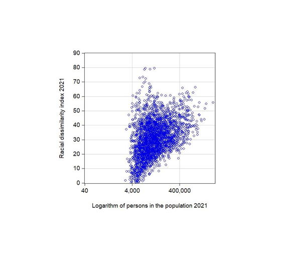
At first glance, no geographical concentration of highly dissimilar counties is easily noticeable. The counties where more than half of the non-Hispanic White population would have had to change where they lived for this specific type of racial dissimilarity to disappear are, in fact, peppered across the country. However, the concentration of grayed-out areas in sparsely populated parts of the country suggests there is a relationship between the size of the population in a county and its racial dissimilarity index. We created a scatter plot of those data to look into this idea.

Each blue circle in our second data graph represents a county: Its racial dissimilarity index is on the vertical axis and its population size is plotted on the horizontal axis. The shape of the data cloud indicates that, on average, as population size increases, the racial dissimilarity index grows. In other words, Census tracts in more-populous areas are less alike than Census tracts in less-populous areas.

However, even among relatively large counties, there is remarkable variation in racial housing patterns. Consider, for example, two counties with almost exactly 400,000 residents: Genesee County, MI, and St. Charles County, MO. The racial dissimilarity index for the Michigan county (57) is more than twice as high as the racial dissimilarity index for the Missouri county (21). So population size is not all that matters here.

How this map was created: In FRED, search for “White to Non-White Racial Dissimilarity (5-year estimate) Index for St. Louis city, MO.” Click on “View Map.” To change the data units into annual growth rates, click on “Edit Map” and select “Units: Percent change from year ago.” How the scatter plot was created: We use a logarithmic scale to plot the population data because, in 2021, population across counties ranged from 2,052 persons to more than 10 million persons. Those numbers could not be easily visualized in a simple graph with linear scales.

Suggested by Diego Mendez-Carbajo.

Updating the name of the television services series in the CPI

Fine-tuning the data to improve the picture quality

FRED aggregates data from various sources. Those sources routinely revise and update the data they produce. After all, more-accurate data allow for better decisionmaking. These sources also update the names of their data series to accurately describe the activity they record. FRED incorporates these updates with an automated process.

One source, the Bureau of Labor Statistics, provides the consumer price index (CPI) dataset, which measures the average change over time in the prices paid by urban consumers. The FRED graph above displays one CPI data series that had its name changed as of February 14, 2023: from “Cable and satellite television service” to “Cable, satellite, and live streaming television service.”

This update to the series name reflects the addition of customizable internet-based live streaming of television services, which had been commonly provided via land cable and satellite wireless signals.

So what does this FRED graph show? The time period is January 1992 to December 2022, the units are percent change from a year ago, and the values are the year-over-year inflation rate of television service prices. These prices had some cyclical ups and downs but were trending downward until 2011, when that declining trend reversed. In fact, price growth for television services has markedly outpaced total price growth for its parent category, recreation services.

Stay tuned to the FRED Blog for more news of updates to additional data series names.

How this graph was created: Search FRED for “Cable, satellite, and live streaming television service.” Next, click the “Edit Graph” button, select the “Line 1” tab, and use the “Units” dropdown menu to select “Percent Change from Year Ago.” Last, select the “Format” tab to change the graph type to “Bar.”

Suggested by Diego Mendez-Carbajo.

Shelter inflation rises up

In the US, we commonly measure inflation with the yearly change in the consumer price index (CPI), which stands at 6.3% for January 2023. As we’ve said before in the FRED Blog, a single number like this can hide a lot of variation across all the goods consumed by Americans. So let’s look at a recent, interesting twist in prices in this country.

The FRED graph above divides the CPI into two parts: prices related to shelter and all other prices. It starts at an index value of 100 in January 2022 and ends in January 2023 to show how prices evolved over the past year. Shelter-only CPI has a value of 107.9, meaning it has increased by 7.9% since January 2022. All-items-except-shelter CPI has a value of 105.7.

The price of shelter has been continuously increasing, while the price for everything else stopped increasing in June 2022 and has even decreased a bit since. Does this mean our latest inflation episode is over except for shelter? Possibly, especially because there are data-collection lags when calculating the cost of shelter. Still, is six months enough time to claim victory and is the CPI even the right measure? We leave these difficult questions for policymakers to answer.

How this graph was created: Search FRED for CPI shelter. Click on “Edit Graph,” open the “Add Line” tab, search again for CPI shelter, but this time select the CPI less shelter. Choose unit “100 for a given date,” type in 2022-01-01, and click on “Apply to all.” Finally, reduce the sample period to one year.

Suggested by Christian Zimmermann.


Subscribe to the FRED newsletter


Follow us

Back to Top