The consumer price index (CPI) follows the price of a basket of goods. The goods in the basket are determined by the purchases of an “average” U.S. household. Each item is tracked at multiple locations and for numerous varieties. The data are then aggregated to form the CPI.
The CPI has been a part of FRED for quite some time (since the early days if not the very beginning). FRED also offers some finer slices of consumer price data. The graph includes three examples: unleaded gasoline, peppers, and tomatoes. These are still aggregates, as the tracked prices come from many locations and, for tomatoes at least, across the various brands, varieties, and other ways of differentiating products.
What immediately gets our attention is how dynamic these lines are. The prices for these items change a lot and with little notice, which is why monetary policymakers in general prefer to look at price indices that exclude food and energy: Volatility can hide the bigger picture of inflation.
To reveal the extent of this volatility, we constructed the graph below, which compares the general CPI and the CPI without food and energy. For the latter, we even included the series without seasonal adjustment to demonstrate that seasonal adjustment does not remove the noise that policymakers are worried about.
How these graphs were created: For the first graph, start from the Average Price Data release table, check the items you want displayed, and click “Add to Graph.” For the second graph, start from the CPI graph and go to the “Edit Graph” panel. From there, open the “Add Line” tab and search for “CPI less food and energy”; add the monthly seasonally adjusted series. Repeat for the not seasonally adjusted series. Finally, adjust the units to “Percent Change from Year Ago” and click “Copy to All.”
The June 13, 2019, FRED Blog post showed how, in a world of ample reserves, the FOMC sets a target range for the federal funds rate (FFR) and uses interest on excess reserves (IOER) and the overnight reverse repurchase agreement facility (ON RRP) to keep the FFR rate in the target range.
Since July 2019, the FOMC has lowered the target range for the FFR twice, effectively injecting liquidity into the banking system. And, at the September 17-18 FOMC meeting, the committee announced a 0.25% cut in the target rate, with an accompanying cut in the interest rate on excess reserves. But ahead of that meeting, the effective FFR spiked, exceeding the upper limit of the target range. So, an additional monetary policy tool was put into action.
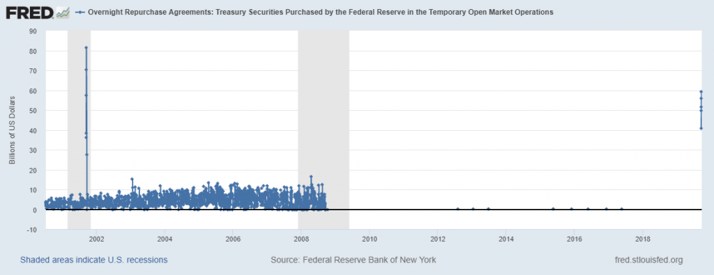
On September 17, 2019, the Federal Reserve Bank of New York began conducting temporary open market operations through overnight repurchase agreements: That is, it purchased Treasury securities held by banks. The FRED graph above shows these recent operations. By default, FRED graphs with daily data show the past 5 years, so these temporary operations look like an ant parade along the x axis that lead to the recent interventions high in the stratosphere of the upper right corner. However, if you expand the graph to show the available data (by adjusting the date slider below the graph), you see these operations occurred almost every day up to 2008. We show this bigger picture in the graph below.
How these graphs were created: Search for “temporary open market operations” and select the “Overnight Repurchase Agreements: Treasury Securities Purchased by the Federal Reserve in the Temporary Open Market Operations (RPONTSYD)” series and click “Add to Graph.” Note that there’s a large number of daily observations here, so the FRED graph automatically does some sampling of the data. In FRED itself, expanding the scroll bar date range will reveal all the data points, which is shown below.
FRED has just added some refugee data from the World Bank that shows the number of refugees in each country since 1960. In the graph above, we chose to show the statistics from three groups of countries classified by level of income: For middle-income and high-income countries, refugees make up well below half a percent of the general population. In low-income countries, it’s substantially more (although the percentage has declined since the early 1990s). Why so?
Refugee migrations generally occur in situations of crisis.
Such crises tend to occur in low-income countries.
Refugees have limited means to choose where to go, so they often end up in neighboring countries that are likely to share income characteristics with the country in crisis. (That is, the country in crisis and its neighbors are more likely to be low-income countries.)
All these factors contribute to more refugees living in low-income countries.
How this graph was created: Search for “refugee” and select the series for low-income, middle-income, and high-income countries and click “Add to Graph.” (If you search for and select them one at a time, use the “Edit Graph” panel’s “Add Line” feature to add them to the same graph one after the other.) For each series, use the “Edit Lines” feature to divide by the relevant population series: For the low-income series, search for and add the series “Population, Total for Low Income Countries.” In the formula box, add “a/b*100.” Repeat for the middle- and high-income series.