According to conventional wisdom, holding gold is a good way to protect oneself against inflation. But let’s try to understand this wisdom a little better with the help of some FRED graphs. The graph above simply shows the monthly general inflation rate (from the CPI) and the monthly gold inflation rate. But this line graph doesn’t offer a very clear picture: The fluctuations in the price of gold are much larger than those for prices in general. So, instead, let’s try a scatter plot, shown below, where every point corresponds to a particular month and its pair of inflation rates. But, again, there’s not much to see here.
Now you may be asking, isn’t it true that, if the general price level is rising, so is the price of gold? To really measure how gold has appreciated, then, we need to remove CPI inflation from gold inflation. The resulting scatter plot is below. Not much of a difference, unfortunately, mostly because there’s not much variation in CPI inflation compared with the variation in gold inflation. (Compare the different ranges on each axis.)
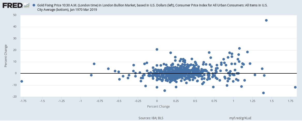
OK. Last try. In the graph below, we switch from monthly inflation to yearly inflation for both measures. And, again, there’s not much of a relationship to see here except when CPI inflation is really high—on the right side of the plot. There, higher CPI inflation is indeed associated with high gold inflation. But this is statistically tenuous because it’s based on only a few data points.
By the way, the practice of massaging the data in many ways is called data mining. Showing only the particular combination that worked out while hiding all the specifications that did not is not considered good research practice.
How these graphs were created: NOTE: Data series used in these graphs have been removed from the FRED database, so the instructions for creating the graphs are no longer valid. The graphs were also changed to static images.
The Great Recession adversely affected employment across all industries. Since the recovery began in 2010, employment has rebounded and the unemployment rate started declining. But this recovery in employment has not been uniform across industries.
Employment in the financial sector has steadily declined as a share of total employment since the onset of the Great Recession. The financial sector averaged around 6.2% of total employment in the ten years preceding the Great Recession, from 1997 to 2007; in the recovery period, from 2010 to 2018, it averaged around 5.7%. It’s also interesting, but perhaps not very surprising, to note that the employment share in financial activities increased through the previous two recessions—in 1991 and in the early 2000s—but fell quite a bit during the Great Recession. And while total employment has grown by nearly 14% in the years spanning the recovery, from 2010 to 2018, financial employment has grown by only 11%.
So the question is, if there are fewer employees in the financial sector relative to the 1990s, how is that impacting output? One way to answer this question is by looking at the value added by the financial industry. The red line on the graph represents value added. It is interesting to note that while value added declined during the recession, it recovered shortly thereafter and has been on an upward trend since then. This implies that industry output has not declined because of slower employment growth, which in turn indicates that other factors must be responsible for this apparent increase in the productivity of labor.
How this graph was created: Search for and select the series USFIRE. From the “Edit Graph” panel, select a quarterly frequency and set the aggregation method to “Average.” Then add the series “PAYEMS” to the same graph and set the formula as a*100/b. Click on the “Add Line” option and search for the series “VAPGDPFI.” In the “Format” tab, scroll down to the formatting options for Line 2 and set the y-axis position to “Right.”
New businesses are typically very small, so they’re not necessarily a strong factor in overall job creation. But they are a first step in the important process of “creative destruction”—the replacement of old, unproductive businesses by new businesses with new ideas, technologies, and processes. Eventually some of these new businesses will grow and become important factors in the economy, and a healthy economy makes it easy for these new businesses to be created. FRED now has data that allow us to compare this process across U.S. states.
The Census Bureau tracks the quarter and the U.S. state in which business applications are made. Then it tracks the quarter in which the new business appears on payroll data. This quarter-to-quarter measurement is obviously coarse, but it averages out to meaningful value given the number of these applications. The map above shows the average length of this interval for all businesses that become active within 8 quarters of their application. Note: This data series doesn’t include businesses that take longer than 8 quarters to open or that never open.
The Census caps the interval at 8 quarters because, honestly, who wants to wait forever for the statistics? In fact, if you want them even more quickly, there’s a measurement after 4 quarters, which is shown in the map below. Take a look for yourself to see where in the U.S. you think businesses open faster.
How these maps were created: The original post referenced interactive maps from our now discontinued GeoFRED site. The revised post provides replacement maps from FRED’s new mapping tool. To create FRED maps, go to the data series page in question and look for the green “VIEW MAP” button at the top right of the graph. See this post for instructions to edit a FRED map. Only series with a green map button can be mapped.