Federal Reserve Economic Data

The FRED® Blog

Economic volatility in emerging economies

By definition, “emerging” economies are in transition from “developing” status to “developed” status, which is generally a bumpy road that may involve more-frequent crises and stronger economic fluctuations. One way to visualize this transition in FRED is to graph per capita GDP growth rates for the BRIC countries (Brazil, Russia, India, China) and compare them with the rate for the U.S. (thick black line). While it is usually better to show fewer series on one graph, the idea here is simply to illustrate that these economies bounce around much more than the U.S. economy does. The U.S. rate is never the highest. On the rare occasions when it is the lowest, it is only barely so—with 2007 being the exception.

How this graph was created: Search for “Constant GDP per capita” for the various countries and add the series to the graph. Transform each series to “Percentage change” and emphasize the line for the U.S. so it stands out (in this case, it is thicker and black).

Suggested by Christian Zimmermann

View on FRED, series used in this post: NYGDPPCAPKDBRA, NYGDPPCAPKDCHN, NYGDPPCAPKDIND, NYGDPPCAPKDRUS, NYGDPPCAPKDUSA

Watching CPI and PCE inflation in FRED

Measures of inflation are some of the most popular data series on FRED. Two of the most important ones are the consumer price index (CPI), constructed by the Bureau of Labor Statistics (BLS) in the Department of Labor, and the personal consumption expenditures price index (PCE), constructed by the Bureau of Economic Analysis (BEA) in the Department of Commerce.

The CPI is probably the most widely watched measure of inflation and is used for many purposes, such as indexing Social Security payments. The Federal Open Market Committee (FOMC) has been looking at the PCE price index since the 1990s, however, and made that index the measure for its official inflation target in January 2012, when they introduced an official target.

To understand how the CPI and PCE inflation rates differ, consider a stylized representation of a price index for the year 2023 as the weighted sum of the prices of three types of goods, which we will call goods 1, 2, and 3.

P2023=w1,2023 p1,2023+w2,2023 p2,2023+w3,2023 p3,2023

The weights, w, represent how much money is spent on each good in the consumption basket. For example, gasoline would get a higher weight in a consumer price index than shoelaces. As relative prices, technology, or people’s tastes change, the weights in the baskets change.

Both the CPI and PCE are constructed in this general way, as the weighted averages of prices of various goods, but they differ.

  1. The two price indices measure somewhat different baskets of goods: The CPI is designed to measure the cost of living for an urban consumer, while the PCE measures a broader cost of living. Because of this difference in emphasis, the weights in the baskets differ and the CPI famously places more emphasis on the cost of housing.
  2. The weights in the CPI basket aren’t revised as often as those in the PCE basket, meaning that the PCE probably better measures consumer responses to rapidly changing relative prices.

The FRED graph above shows that monthly CPI (blue line) and PCE (red line) inflation move closely together, but the CPI generally exceeds the PCE. Over the full sample since 1960, the arithmetic average of 12-month CPI inflation was 3.77% and the standard deviation—a measure of volatility— of that series was 2.83%. The analogous figures for the PCE price index inflation were 3.31% and 2.43%. That is, the CPI inflation rate was 0.46% higher on average and somewhat more volatile. The fact that the PCE weights are revised more often than the CPI weights helps explain the higher average CPI inflation because consumers tend to substitute away from products whose prices rise sharply and the PCE index more quickly reflects such behavior.

The purple line on the FRED graph shows the difference between the CPI and PCE inflation rates, with an average value of 0.46%. This difference is almost always positive but small, usually in the range of 0 to 1%, but it does increase with overall inflation rates.

One component that may also help depict the difference between these two price indexes is annual inflation in “imputed rental of owner-occupied housing.” Shown by the green line, this is basically what a homeowner would have to pay to live in the house if they were renting it. Since CPI has higher weights for housing, this imputed rent should contribute much more to the CPI than the PCE. And it does seem to be correlated with the overall difference between the CPI and PCE inflation rates (purple line), but saying any more would require more careful analysis.

How this graph was created: On FRED, search for and select “CPI.” From the “Edit Graph” panel, change “Units” from “Index” to “Percent Change from Year Ago.” With the “Add line” option, search for “PCE” and select “Personal Consumption Expenditures: Chain-type Price Index,” then click “Add data series.” Repeat for “imputed rent,” selecting “Imputed rental of owner-occupied housing.” Add a line again, with the CPI and PCE series and apply formula a-b. Toward the top of the editing box, select “Percent Change from Year Ago” in the “Units” box and select “Copy to all.” Adjust the sample period to start on 1960-01-01.

Suggested by Christopher Neely.

Mark your FRED data release calendar

How to dig into the history of FRED data releases

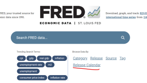
FRED provides not only data, but also a data release calendar. The calendar shows the dates and times of economic announcements from the US government and other sources. Simply click on “Release Calendar” on the FRED home page.

The default for the release calendar is the release data for the current week. But you can easily go back in time to find historical data in these releases: Use the radio button to choose weeks and months and the dropdown list to choose years. You can also select a specific type of release with that pulldown menu.

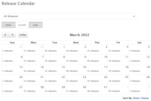
Example 1: If you select, say, the year 2022 and the month of March, and you leave the pulldown menu set to its default of “All Releases,” then you’ll see a calendar of all the releases for each day in March 2022. Click on the releases link on a particular day in the calendar, and links for the releases on that day will appear below the calendar.

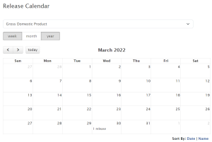
Example 2: If you select March 2022 but select “Gross Domestic Product” (GDP) from the pulldown menu, you’ll see all the GDP releases for that month. Turns out, there was only one GDP release that month: at 7:30 AM, Central Time, March 30, 2022. Click the link on March 30, 2022, on the calendar to see information below the calendar. The link on the left goes to the historical GDP data series page, which provides both nominal and real GDP measures and breakdowns of GDP by personal and government categories. The status column on the right displays the term “Updated,” which indicates this FRED series has indeed been updated with this March 30, 2020, data release.

There are at least a few reasons why you might want to know about the dates of data releases.

Newly released data can move financial markets and generate news stories. If you look at the releases for a given day, you can then see which releases may have made an impact, including which releases the financial press judged to be important.

If you are testing historical forecasts, you want to see when a particular type of data was released to know exactly when it could have been used in those forecasts. If you’re testing, say, the use of GDP to predict some other variable, then you want to have the best estimate of GDP available on that specific forecast date. (For variables such as GDP, which are revised after their initial release, you likely want to look up the original vintage—i.e., the value of the initial release of GDP on a specific date—on ALFRED.)

And you might want to know when important data releases will occur so that you’re prepared for them and the possibility of short-term volatility that may occur in financial markets. Research indicates that the most important announcements for financial markets are monetary policy announcements and employment data releases.

This release calendar is just one way FRED provides economists and anyone who loves economics with data and information for economic decisionmaking.

Suggested by Christopher Neely.


Subscribe to the FRED newsletter


Follow us

Back to Top