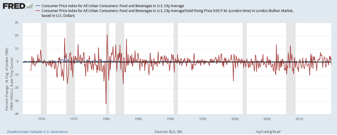
Imagine paying for food not in dollars, but in gold. How different would the world be? The graph above is an attempt to depict the difference it would make to food prices. Taking the subcategory “food and beverages” in the consumer price index, we compare the price in dollars (in blue) with the price in gold (in red). The graph shows month-to-month percentage price changes. The price in gold is calculated by dividing the price index by the price of gold in dollars.
The graph makes very apparent that, if we priced food in gold, there would be wild fluctuations in those food prices. Consider the units on the vertical axis: Prices change several percent in either direction from one month to the next. But would price fluctuations really be that wild? Probably not, as it’s costly for sellers to change prices (“menu costs”) and they would make those changes less frequently than the graph shows. Yet, the essential premise remains: The Fed has a mandate to keep prices (in dollars) stable, which it can do by managing the money supply. Such stability is not possible with the gold supply. It is thus unavoidable that gold-based prices would fluctuate more.
How this graph was created: NOTE: Data series used in this graph have been removed from the FRED database, so the instructions for creating the graph are no longer valid. The graph was also changed to a static image.
Suggested by Christian Zimmermann
The new FRED release tables make it much easier to find related series. One example is Table A-13 in the BLS’s household data release, which describes the employment situation by occupation. The graph here shows the unemployment rate in some occupations: Clearly, any occupation linked to producing stuff or moving it has 1) a higher unemployment rate and 2) substantial seasonal fluctuations. Also, even in the best times (booms in the summer) these occupations maintain a higher unemployment rate than others. Why is that? A similar graphical ladder exists for unemployment rates by educational attainment (discussed in a previous post on this blog), and similar factors may be at work behind this graph.
How this graph was created: Go to release Table A-13, select the relevant series, and click on the “add to graph” button.