Federal Reserve Economic Data: Your trusted data source since 1991

The FRED® Blog

Regional differences in mean and median family income

Growing inequality across and within regions

The FRED Blog has examined family incomes in the United States before, specifically the typical (or median) family income and its growing gap relative to the average (or mean) family income. Here, we revisit the topic of regional income inequality by comparing differences in the evolution of median and mean family income.

The FRED graph above uses U.S. Census data to show how different the typical (or median) family income is from the mean (or average) family income. The graph is divided into the four regions defined by the Census: Northeast, Midwest, South, and West.* Each line plots the regional dollar value, measured at 2020 prices, of mean family income divided by median family income.

In all four regions, the value of that ratio is larger than one, indicating that average income is larger than typical income. Moreover, that ratio is increasing in value over time, suggesting one of the following is happening: (1) rich families are becoming relatively richer, (2) poor families are becoming relatively poorer, (3) both (1) and (2) are happening at the same time in different proportions.

However, the trend of increasing family income inequality hasn’t followed the same pattern across all regions: It was slower to pick up in the Midwest, where it caught up to the rest of the country only in 2020. More data are needed to determine if this increased Midwestern family income inequality is permanent. Finally, the patterns discussed above also describe the evolution of mean and median personal income by region.

*See this map to find out which Census region you live in.

How this graph was created: Search for and select “Real Mean Personal Income in Midwest Census Region.” Next, customize the data by searching for and selecting “Real Median Personal Income in Midwest Census Region.” Next, create a custom formula to combine the series by typing in “a/b” and clicking “Apply.” Click the “Add Line” tab and repeat the previous three steps to add the data from the other three U.S. Census regions to the graph.

Suggested by Diego Mendez-Carbajo.

The new St. Louis Fed Macro Snapshot

People who work with economic data are familiar with the most popular indicators in FRED—the unemployment rate, GDP, interest rates, etc. But FRED contains close to a million data series, each of which can be modified and presented in various ways. Given the sheer size and scope of FRED, it can be difficult to know which other series you should focus on if you want to better understand the current economy. You may ask yourself, “Well, what do economists and policymakers look at—and how do they think about those indicators?”

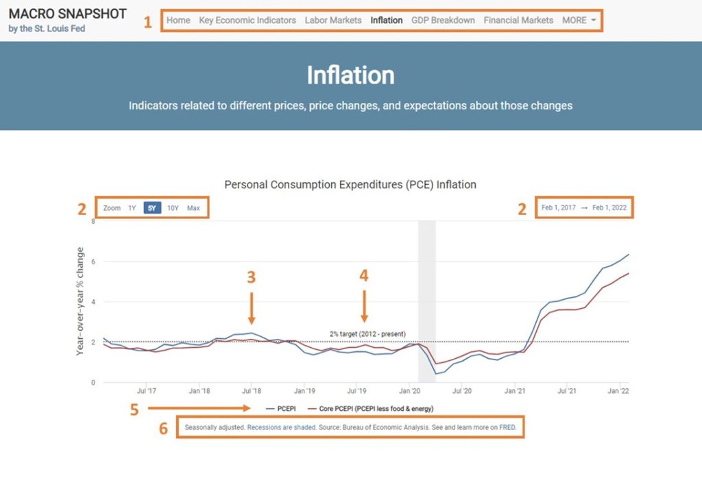
The St. Louis Fed’s new Macro Snapshot answers these and other questions. The Macro Snapshot is a new portal to the FRED dataverse. It compiles into a single interactive dashboard important economic indicators from FRED—the indicators economists and policymakers at the St. Louis Fed follow when analyzing the current economy.

Graphs on the Macro Snapshot often link to their FRED series and blog posts, where users can learn more about the macroeconomic importance of a given indicator. Indicators are also broken down by topic, allowing users to easily explore and categorize the Macro Snapshot’s select list of series.

The image above shows the top of one Macro Snapshot page, with the following features:

  1. Pages categorizing series by topic.
  2. FRED-style buttons and ranges to adjust graphed time periods.
  3. Graph elements that give additional context to FRED series.
  4. The ability to hover over points to see corresponding dates and values.
  5. The ability to click series on and off using legends.
  6. Captions that explain aspects of the graph, cite data sources, and link to FRED (and other resources as necessary) for more in-depth descriptions.

The data on the Macro Snapshot are updated directly from FRED using its public API, which lets its underlying code pull FRED data automatically. Its content will change as economic conditions evolve or new data are added to FRED. While it does not and cannot contain everything sufficient for understanding the economy or making policy, it is a useful window into the current perspective of economists and policymakers at the St. Louis Fed—and a valuable curation of FRED’s ever-expanding data offerings.

Here’s another link for you to check it out.

Suggested by Charles Gascon and Devin Werner.


Subscribe to the FRED newsletter


Follow us

Back to Top