Economic research has found that the neighborhood in which a child grows up can influence their adult outcomes, such as educational attainment and income. That alone is a powerful enough reason for US households to pack up and move across the city or even around the country.
Every year, the US Census tracks movement (and other data) throughout the country by surveying a broad sample of households and records: Among other information, they track their current and previous counties of residence. With those data, the Census calculates a 5-year estimate of the difference between inflows and outflows of residents from county to county. This is called net migration.
The FRED map above shows the estimated county-to-county net migration flows between the years 2016 and 2020. We customized the data groupings to sort all 3,140 US counties into two groups: counties that gained residents and thus registered positive net migration (shown in green) and counties that lost residents and thus registered negative net migration (shown in yellow). No clear pattern is visible to the naked eye, so we created a second data visualization to group the counties by state.
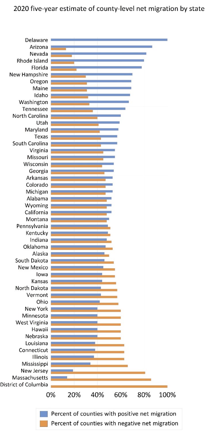
The second graph shows the percent of counties in each of the 50 states plus the District of Columbia that recorded positive net migration (blue bars) and the percent of counties in each state that recorded negative net migration (orange bars). The states are sorted from largest to smallest proportion of counties with net resident inflows. Keep in mind that different states have different numbers of counties. Note that all three counties in Delaware recorded positive net migration, so that state is listed at the top. Conversely, the District of Columbia is a county equivalent and, because it experienced negative net migration, it’s listed at the bottom.
Overall, the bar graph shows states such as Arizona, Nevada, and Florida had far more counties recording net resident inflows than outflows. The data do not show where the new residents came from or their demographic characteristics. We can’t say if those states gained residents from states such as Massachusetts, New Jersey, and Illinois, which lost residents. Finally, there are 4 states where the percent counts of counties is slightly off: Each of these states is home to one county that experienced zero net migration. You can see those counties, highlighted in red, in this FRED map.
How this map was created: In FRED, search for “Net County-to-County Migration Flow (5-year estimate) for Miami-Dade County, FL.” Click on “View Map.” To change the data groupings, use the “Data grouped by” dropdown menu to select “User Defined Method.” Change the “Number of color groups” to 2 and enter “0” in the topmost box.
Suggested by Diego Mendez-Carbajo.