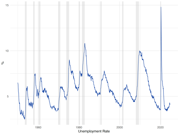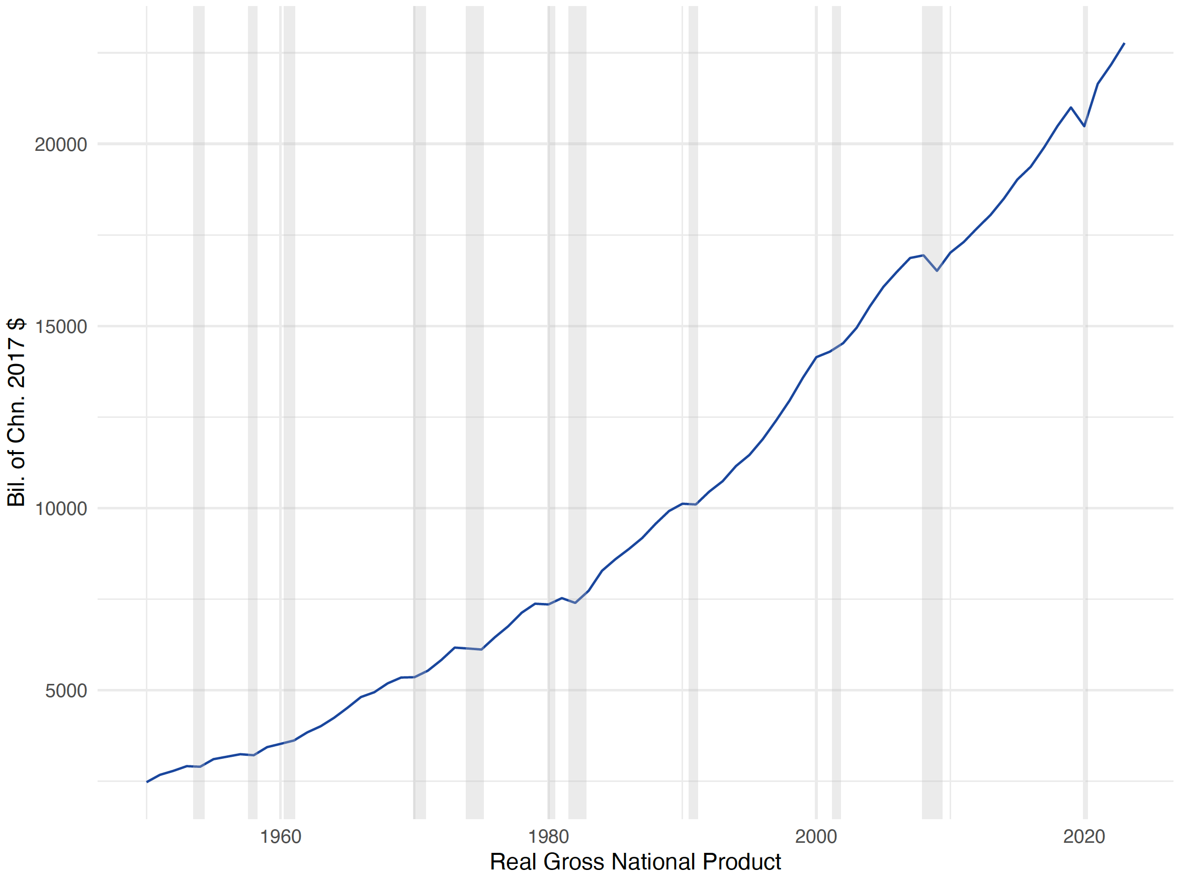

FRED is a treasure trove of economic data, offering a vast array of time series data on everything from GDP and unemployment rates to interest rates and housing prices.
R is a powerful and flexible open-source programming language, widely used in data science, statistics, and machine learning. Its extensive ecosystem of packages allows users to perform complex data analysis, visualization, and modeling tasks.
FRED is user friendly and a great starting point for many. Those looking for more advanced analysis and customization often turn to programming languages like R. Today we describe one R package that works especially well with FRED data: fredo.
In general, the fredo R package streamlines the interaction with the FRED API, provides an accessible interface, and allows for much customization.
Key features of fredo
- Automated data retrieval: Retrieve FRED data (including historical data) directly from the API using the fredo package, simplifying the process of downloading and processing the data.
- Flexible plotting: With plot_fredo, create individual or combined plots with extensive customization, including adding recession bars, changing plot dimensions, and generating LaTeX code.
- Data filtering: Filter data based on start and end dates for focused analysis.
- Export options: Save plots as PDFs for use in reports, papers, or presentations.
Installation
To install fredo, use the following command to get it directly from GitHub:
# Install devtools if you haven't already
install.packages("devtools")

# Install fredo package from GitHub
devtools::install_github("manutzn/fredo")
Once installed, load the packages into your R session:
library(fredo)
library(jsonlite)
Setting up your FRED API Key
To use fredo to fetch data from the FRED API, you need to obtain an API key:
- Register for an API Key:
- Store Your API Key Securely:
- Option 1: Assign it directly in your R script (not recommended for shared code).
api_key <- "your_api_key_here"
- Option 2: Set it as an environment variable in your .Renviron file. Add the following line to your .Renviron file:
FRED_API_KEY=your_api_key_here
Then access it in R using:
api_key <- Sys.getenv("FRED_API_KEY")
The fredo function
The main function in the package is fredo(), which allows you to fetch data from the FRED API. The function retrieves data for specified series IDs over a date range and returns a data frame for easy analysis.
Function Signature
fredo(api_key, series_ids, start_date, end_date)
Parameters
api_key: Your FRED API key as a string.
series_ids: A character vector of FRED series IDs to retrieve (e.g., c(“GNPCA”, “UNRATE”)).
start_date: The start date for data retrieval in ‘YYYY-MM-DD’ format.
end_date: The end date for data retrieval in ‘YYYY-MM-DD’ format.
Returns
A data frame containing the combined data for all specified series, with columns including ‘date’, ‘value’, ‘id’, and ‘title’.
Basic Usage of fredo
Here’s how to use fredo to fetch data from the FRED API:
# Set your FRED API key
api_key <- Sys.getenv("FRED_API_KEY")  # Recommended method

# Define the series IDs and date range
series_ids <- c("GNPCA", "UNRATE")
start_date <- "1950-01-01"
end_date <- "2024-12-31"

# Fetch the data
Sample Output:
        date    value    id                        title
1 1950-01-01  2198.50 GNPCA Real Gross National Product
2 1951-01-01  2373.70 GNPCA Real Gross National Product
3 1952-01-01  2474.70 GNPCA Real Gross National Product
4 1953-01-01  2607.70 GNPCA Real Gross National Product
5 1954-01-01  2635.10 GNPCA Real Gross National Product
6 1955-01-01  2808.50 GNPCA Real Gross National Product
Advanced features and customization with plot_fredo
The plot_fredo function offers several parameters to customize the generated plots:
Combining multiple series
To combine multiple series into one plot, set the combine parameter to TRUE:
plot_fredo(
  dataset = fred_data,
  path = "output_directory/",
  combine = TRUE
)
Adding or removing recession bars
You can include recession bars in your plots by default. To remove them, set show_recessions to FALSE:
plot_fredo(
  dataset = fred_data,
  path = "output_directory/",
  show_recessions = FALSE
)
Adjusting plot size
Customize the dimensions of your plot by setting plot_width and plot_height in centimeters:
plot_fredo(
  dataset = fred_data,
  path = "output_directory/",
  plot_width = 20,
  plot_height = 15
)
Example workflow
# Define the series IDs and date range
series_ids <- c("GNPCA", "UNRATE")
start_date <- "1950-01-01"
end_date <- "2024-12-31"

# Fetch the data
data <- fredo(api_key, series_ids, start_date, end_date)

plot_fredo(
  dataset = data,
  path = "output_directory/",
  plot_width = 20,
  plot_height = 15
)
For more information, examples, and updates, visit the GitHub repository.
Suggested by Manu Garcia and Carlos Garriga.


