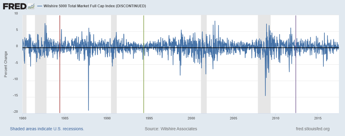
Some researchers have studied the possible effects that astronomical and meteorological conditions have on the stock market. So, what should investors do about the total solar eclipse today? First, the bad news: As you’re reading this, it’s already too late to react. Second, the good news: The graph above depicts the weekly returns of the Wilshire Index, with colored vertical lines depicting three annular solar eclipses visible from the U.S. during the sample period. (The gray bars represent recession periods.) At least for the annular variety, there’s not much to write home about regarding the stock market. The weekly returns were -1.2%, -2.1%, and -0.1%, respectively, which are all well within normal fluctuations for weekly data on stock markets. And the fact that all three are negative isn’t worrisome in a statistical sense. But is there a reason to come to a different conclusion for a total eclipse? Well, a total eclipse is sufficiently rare that the evidence will be anecdotal. So we probably need to check FRED again in a century or two to find more conclusive evidence.
How this graph was created: Search for “Wilshire” and click on your preferred index. In the “Edit Graph” section, change the frequency to “week ending Saturday” to get more data points on the graph. (Daily data are automatically aggregated once there are too many points.) Change units to “Percent Change.” To add the vertical lines, click on the “Add Line” tab, expand “Create user-defined line,” and click on “Create line.” Here you have the opportunity to enter two dates and one value for each. To make the line vertical, use the same date for the start and the end. In this case, the three eclipses were on 1984-05-30, 1994-05-10, and 2012-05-20. Then put values that are just within the limits of the graph—in this case -19.9 and 9.9.
Suggested by Christian Zimmermann.


