Economists, banking regulators, policymakers, and financial market analysts use a variety of indicators to monitor financial market conditions. Many indicators are constructed from market-based prices, since information about the health of the economy, a bank, or a firm is often reflected in equity and debt markets. So market prices are forward-looking indicators of potential changes in economic and financial conditions.
The best known macroeconomic measures are interest rate spreads between so-called “risk-free” and “risky” securities. For example, the spread between long-term and short-term Treasury yields—often termed the yield curve—tends to be a reliable forecaster of future economic growth. (See McCracken, 2018, and Owyang and Shell, 2016.)
To help the public monitor financial market conditions on a weekly basis, the St. Louis Fed unveiled a financial market stress index (FSI) in 2010. (See Kliesen and Smith, 2010.) Similar to other FSIs, the St. Louis Fed’s (STLFSI) measures different types of financial market stress. Falling prices of financial market assets—such as stock prices—is an obvious example, since it could signal expectations of lower corporate profits due to slower growth of aggregate economic activity. Other types of stress include changing market perceptions of “risk” in its different forms. As noted above, risk is often measured by examining interest rate spreads: Default risk is regularly measured as the difference between yields on a “risky” asset (e.g., corporate bonds) and a “risk-free” asset (e.g., U.S. Treasury securities). But financial market stress can arise in other dimensions, too.
One type of risk prominent in the 2008-2009 financial crisis is once again present—in the current COVID-19 (novel coronavirus) crisis. It is the inability of many financial institutions to secure funding to finance their short-term liabilities, such as repurchase agreements (repos). This type of risk is known as “liquidity risk.” Yet another type of risk is uncertainty about the future direction of inflation, termed inflation risk.
The STLFSI, as with all other FSIs, attempts to measure financial market stress by combining many indicators into a single index number. This index number then becomes a collective measure of financial market stress. How is this accomplished?
The STLFSI is calculated using principal component analysis (PCA), which is a statistical method of extracting a small number of factors responsible for the co-movement of a larger group of variables. Specifically, the STLFSI is the first principal component of 18 distinct measures of financial stress and is thus a measure of overall financial market stress. The STLFSI used weekly data beginning in late 1993 from 18 data series: 7 interest rates, 6 yield spreads, and 5 other indicators. Values of the STLFSI above 0 indicated higher-than-average levels of financial market stress, while values below 0 indicated lower-than-average levels of stress.
Over time, we understood that the original construction of the STLFSI wasn’t adequately capturing some stresses that had developed in the financial markets. This was easy to spot visually on a graph: Despite several economic and financial market developments, the index fell below 0 in mid-2010 and has indicated below-average levels of financial market stress ever since. So we’ve unveiled an improved version—STLFSI 2.0—that makes a few simple, but necessary, changes to the original version unveiled in 2010.
Our plan is to publish a more thorough analysis later in the year, documenting our motivation and methodological changes that we believe make STLFSI 2.0 an improvement.
The key difference between versions 1.0 and 2.0 is that 2.0 uses daily changes in interest rates and stock prices, rather than the levels of interest rates and stock prices in the PCA calculation. Why is this important? The full answer is more complicated, but the primary reason is that interest rates have trended lower and stock prices have trended higher, on average, over the period the STLFSI calculation covers. This has introduced a subtle but nevertheless important statistical bias in the calculation of the STLFSI. This table summarizes the transformation applied to the data series used to construct the STLFSI.
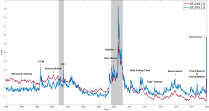
The figure plots the new version of the STLFSI along with the original version we’re retiring. Here are two examples why we believe the STLFSI 2.0 more accurately measures financial stress:
On August 5, 2011, Standard and Poor’s reduced the long-term sovereign credit rating on the United States from AAA to AA+. Although other rating agencies maintained the AAA-rating on U.S. Treasury debt, this action severely rattled equity markets, as the Dow Jones Industrial Average fell nearly 2,000 points over the next two weeks. However, the original version of the STLFSI continued to report below-average levels of financial market stress (values less than 0). The revised STLFSI, however, moved decisively above 0, indicating above-average levels of financial market stress, peaking at 1.2.
The second example is the ongoing turmoil in financial markets stemming from the fear and uncertainty associated with the COVID-19 pandemic. Since mid-February 2020, and continuing through the week ending March 20, 2020, COVID-19 uncertainty has triggered a massive sell-off in stocks and consequent plunge in stock prices, sharp declines in interest rates, and stunning increases in financial market volatility. Still, the original version of the STLFSI continued to report financial stress slightly below average (-0.1). The revised STLFSI, however, has increased sharply—reminiscent of the worst of the financial market turmoil during the Great Recession in 2008-2009—registering a value close to 5.8.
The data and information services of the St. Louis Fed’s Research Division are intended to illuminate economic and financial concepts, educate, and enhance decisionmaking. In this vein, it is our view that STLFSI 2.0 better captures evolving stresses in financial markets. Our new version suggests that the tectonic upheaval in financial market conditions today has, thus far, been surpassed only by the upheaval registered in 2008-2009.
Suggested by Kevin Kliesen and Michael McCracken, with the research assistance of Kathryn Bokun and Aaron Amburgey.
