Federal Reserve Economic Data

The FRED® Blog

Markets in the shadow of the eclipse

Could the solar eclipse affect stock market activity?

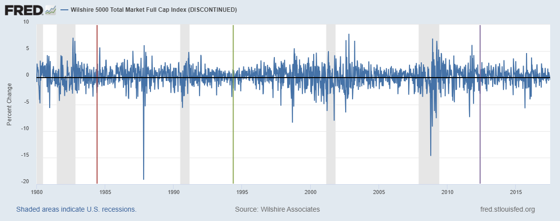
Some researchers have studied the possible effects that astronomical and meteorological conditions have on the stock market. So, what should investors do about the total solar eclipse today? First, the bad news: As you’re reading this, it’s already too late to react. Second, the good news: The graph above depicts the weekly returns of the Wilshire Index, with colored vertical lines depicting three annular solar eclipses visible from the U.S. during the sample period. (The gray bars represent recession periods.) At least for the annular variety, there’s not much to write home about regarding the stock market. The weekly returns were -1.2%, -2.1%, and -0.1%, respectively, which are all well within normal fluctuations for weekly data on stock markets. And the fact that all three are negative isn’t worrisome in a statistical sense. But is there a reason to come to a different conclusion for a total eclipse? Well, a total eclipse is sufficiently rare that the evidence will be anecdotal. So we probably need to check FRED again in a century or two to find more conclusive evidence.

How this graph was created: Search for “Wilshire” and click on your preferred index. In the “Edit Graph” section, change the frequency to “week ending Saturday” to get more data points on the graph. (Daily data are automatically aggregated once there are too many points.) Change units to “Percent Change.” To add the vertical lines, click on the “Add Line” tab, expand “Create user-defined line,” and click on “Create line.” Here you have the opportunity to enter two dates and one value for each. To make the line vertical, use the same date for the start and the end. In this case, the three eclipses were on 1984-05-30, 1994-05-10, and 2012-05-20. Then put values that are just within the limits of the graph—in this case -19.9 and 9.9.

Suggested by Christian Zimmermann.

View on FRED, series used in this post: WILL5000INDFC

Leaves fall, prices rise

Tracing the timing of school supply price hikes

It’s backpack season, and many Americans are starting a new school year. A recent FRED Blog post covered the impact of seasonality. This post covers education-related data—specifically, the cost of books and supplies. The top graph shows the monthly changes in the price of educational books and supplies over the past ten years, using the consumer price index, which measures inflation by reporting the percent change over time, on average, of a variety of goods and services paid for by U.S. urban consumers. In the past decade, educational supply costs have tended to rise most significantly in August and January, coinciding with the beginning of academic semesters for most students.

Seasonal adjustment accounts for these variations by using data from previous years to smooth seasonal eccentricities. The graph above shows the difference between the raw and adjusted CPI indices, showing that level-differences have increased over the past several decades. However, the difference between indices may not show the whole story, as CPI is used to report inflation as a percent change. The next graph shows the difference in the monthly percent change in the price of books and supplies between the raw and adjusted data, showing that the seasonal difference in the monthly price change has actually decreased over time.

The seasonal changes, besides decreasing, have also scattered across the school year. In the early 1970s, prices consistently rose each October and remained fairly stable during the remaining months. In the next decade, spikes emerged at the beginning of the calendar year as well, presumably as consumers spent more on supplies for the second semester of the school year. In recent years, the autumn spike in prices has begun earlier, shifting from October to August and September, likely reflecting changing market strategies and school schedules.

The crucial question remains: When can I find the best deals on school supplies? You may not want to ask your parents for the answer. Older folks may advise against buying in October, based on their experiences of cost increases, and propose an August shopping trip instead. However, today’s students may want to make the most of the price decreases of the early summer and late fall, with back-to-school shopping trips in July and December.

How these graphs were created: For the first graph, search for “CPI US Books and Supplies” and select the not seasonally adjusted, monthly series. From the “Edit Graph” section, adjust the units to “Percent Change.” From the “Format” tab, change the graph type to “Bar.” Finally, adjust the graph to display data from the last 10 years using the “10Y” button in the top right corner of the graph page. For the second graph, search for the same series: “CPI US Books and Supplies,” not seasonally adjusted, monthly. From the “Edit Graph” section, add the seasonally adjusted data to line 1 by searching for “CPI US Books and Supplies adjusted” in the box below “Customize Data.” Click “Add.” In the formula tab, type “a-b” and click “Apply.” For the last graph, follow the steps for the previous graph, but change the units for both series to “Percent Change.” In the format tab, select “Bar” as the graph type.

Suggested by Maria Hyrc.

View on FRED, series used in this post: CUSR0000SEEA, CUUR0000SEEA

Comparing quality of education in the United States and China

Penn World Tables reveal China's great leaps toward the U.S.

An economy’s long-term growth prospects depend on many factors, including the education of its workers. One measure of a country’s quality of education is the index of human capital from the Penn World Tables. This index combines years of schooling and returns to education, and it can be used to rank and evaluate the quality of education in each country.

The graph traces the evolution of the index of human capital per person for the United States and China from 1950 to 2014. Two patterns emerge:

  1. The index of human capital has been consistently lower in China than in the United States during the entire period.
  2. In both countries, the index has increased, reflecting an increase in the quality of the education; however, the increase has been more pronounced in China than in the United States. In particular, from 1952 to 2014, the index has increased by a factor of 1.42 in the United Sates and a factor of 2.22 in China.

We may expect this trend to continue in China, whose 13th Five-Year Plan for 2016-2020 includes the goal of promoting education by encouraging the entrepreneurship and innovation abilities of students and developing continuous education in China.

How this graph was created: Search for “Index of Human Capital per Person for United States” and choose the series you want. The add line 2 to the existing graph by clicking the “Edit Graph” button and using the “Add Line” tab to search “Index of Human Capital per Person for China.” Finally, go to the “Format” tab within “Edit Graph,” and select “Dash” under Line 1’s line style and select “Right” for line 2 Y-axis position.

Suggested by Ana Maria Santacreu.

View on FRED, series used in this post: hciyiscna066nrug, hciyisusa066nrug


Subscribe to the FRED newsletter


Follow us

Back to Top