The Bureau of Labor Statistics (BLS) released its most recent employment report on March 8: In February of this year, the nonfarm economy, on net, created only 25,000 private-sector jobs and 20,000 jobs overall. One part of this report is the establishment survey, which contributed some of the weakest numbers since the past recession.
Forecasters failed to predict these anemic jobs numbers. In fact, before the report’s release, consensus market expectations foresaw 180,000 jobs being created in February. Thus, consensus expectations “missed” the February payroll number by 160,000 persons on the downside. The household survey component of the report was stronger, with the unemployment rate declining by 0.2%. According to the BLS, this decline in unemployment “reflects, in part, the return of federal workers who were furloughed in January due to the partial government shutdown.”
Another well-known statistic used to predict the BLS jobs number is the ADP national employment report. It’s produced by the ADP Research Institute, which is part of ADP. (ADP is an American company that provides human resource and payroll management software and measures nonfarm private sector employment using anonymous data from its clients.) The ADP report, which is released monthly a few days before the BLS employment numbers come out, predicted an increase in private nonfarm payroll of 183,000 in February. Thus, the ADP report differed from the BLS number by 158,000. This difference was one of the largest in 14 years, relative to forecast errors in months outside of U.S. recessions.
FRED provides an integrated picture of all this in the graph above, which combines three monthly series: BLS total nonfarm payroll, BLS government employment, and ADP total private nonfarm payroll. All three are presented as their month-over-month changes in thousands of persons. We combine the three series by first taking the difference of the first two. This gives the change in private nonfarm payroll according to the BLS. Second, we construct a “forecast error” by subtracting the ADP number (which we use as our forecast) from the actual BLS private payroll number.
Excluding five months during the recession (the shaded section in the graph), the downside difference between the BLS and ADP numbers for February employment was larger than the downside difference of any other month since 2003.
How this graph was created: Search for “total nonfarm payrolls,” select the series “All Employees: Total Nonfarm Payrolls,” and click “Add to Graph.” From the “Edit Graph” panel, use the “Edit Line 1” feature to “Customize data”: In this field, enter “government employees.” From the list of options, choose “All Employees: Government” and click “Add.” Again under “Customize data,” search for and add “Total Nonfarm Private Payroll Employment.” The first two series are from the BLS and the third is from ADP. For each of these three series, adjust the units to “Change, Thousands.” Next, compute the series shown here by subtracting the other two. FRED denotes the variables for each series in order: So, enter “a-b-c” into the “Formula” box and click “Apply.”
Here at the FRED Blog, we often represent economic measures such as consumption or investment as a share of GDP. (For example, a recent post looked at the trade balance as a share of GDP.) We do this to account for general growth and inflation: Most macroeconomic measures grow over time because (1) the overall economy grows and (2) prices tend to increase. For many economic questions, what really matters is how economic measures relate to other measures, such as GDP. Now, when you add up all the components of GDP, you get GDP. This is exactly what we represent in the graph above, the share of GDP in GDP. This is an extremely important series to watch: If it deviates from its current trend, we know that something has gone terribly terribly wrong.
How this graph was created: Use the release tables on the percentage shares of GDP, select annual or quarterly (it doesn’t matter for this graph), and select GDP (the first line).
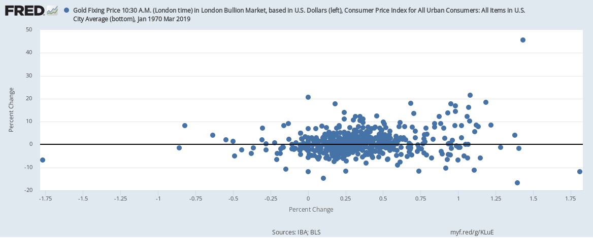
According to conventional wisdom, holding gold is a good way to protect oneself against inflation. But let’s try to understand this wisdom a little better with the help of some FRED graphs. The graph above simply shows the monthly general inflation rate (from the CPI) and the monthly gold inflation rate. But this line graph doesn’t offer a very clear picture: The fluctuations in the price of gold are much larger than those for prices in general. So, instead, let’s try a scatter plot, shown below, where every point corresponds to a particular month and its pair of inflation rates. But, again, there’s not much to see here.
Now you may be asking, isn’t it true that, if the general price level is rising, so is the price of gold? To really measure how gold has appreciated, then, we need to remove CPI inflation from gold inflation. The resulting scatter plot is below. Not much of a difference, unfortunately, mostly because there’s not much variation in CPI inflation compared with the variation in gold inflation. (Compare the different ranges on each axis.)
OK. Last try. In the graph below, we switch from monthly inflation to yearly inflation for both measures. And, again, there’s not much of a relationship to see here except when CPI inflation is really high—on the right side of the plot. There, higher CPI inflation is indeed associated with high gold inflation. But this is statistically tenuous because it’s based on only a few data points.
By the way, the practice of massaging the data in many ways is called data mining. Showing only the particular combination that worked out while hiding all the specifications that did not is not considered good research practice.
How these graphs were created: NOTE: Data series used in these graphs have been removed from the FRED database, so the instructions for creating the graphs are no longer valid. The graphs were also changed to static images.