Federal Reserve Economic Data

The FRED® Blog

FRED adds interplanetary data

FRED pushes the boundaries of data availability. It currently boasts close to 800,000 times series, including international data that are mappable with GeoFRED. But FRED hadn’t featured any interplanetary data until now.

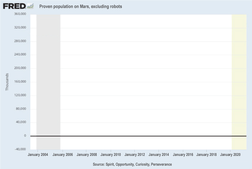
The FRED Team has collaborated with the Scientific Knowledge in Extra-Terrestrial Content Hub, Youngstown (SKETCHY) to integrate some of the data from the NASA Mars exploration rovers.

FRED has scores of socio-economic time series, the most basic data category. And that is the first type of Martian data to be added to FRED. This series starts with data from the first rovers, Spirit and Opportunity, in January 2004. (Sojourner, in 1997, was too short-lived to offer significant data.) The currently active rovers, Curiosity and Perseverance, provide continued opportunities for interplanetary data enthusiasts. We hope to expand coverage with a prototype FRED rover, Confidence Interval. We also hope to expand to interstellar trade data, so our users can test empirically some conjectures from the economic literature.

How this graph was created: Search FRED for “Mars” and click on the most appropriate link.

Suggested by Genevieve Podleski and Christian Zimmermann.

Upheaval in the U.S. housing market

Tracking higher prices and lower supply state by state

In 2020, being confined at home—say, with children or new work requirements—may have changed people’s housing preferences. At least temporarily. New demand for space has led to a rush on single-family homes and, naturally, a stronger-than-usual increase in prices.

Our GeoFRED map above shows that price increases were unequal across the U.S. states from 2019:Q4 to 2020:Q4. California had among the smallest price increases, while the Mountain West region and to some extent the South had strong increases.

The supply of housing can’t easily accommodate increases in demand, especially when they’re sudden. It takes time to buy land, plan, and build. Also, construction costs have been higher because of pandemic restrictions, shortages in materials, and increased demand. This has all translated in a dramatic decrease in the number of houses up for sale.

The GeoFRED map below shows how much that housing inventory has decreased in each state from February 2020 to February 2021. It looks remarkably similar to the above map. Quite a few states have less than half the inventory for sale from a year prior.

How these maps were created: The original post referenced interactive maps from our now discontinued GeoFRED site. The revised post provides replacement maps from FRED’s new mapping tool. To create FRED maps, go to the data series page in question and look for the green “VIEW MAP” button at the top right of the graph. See this post for instructions to edit a FRED map. Only series with a green map button can be mapped.

Suggested by Christian Zimmermann.

Are we expecting too much inflation?

CPI vs. University of Michigan's survey of consumers' inflation expectations

This FRED graph compares expected inflation and actual inflation. In recent years, expectations (in red) have been consistently above realizations (in blue). Why?

How people form expectations is a fascinating topic, as expectations drive so many economic decisions. One important point here is that, individually, we notice relatively few prices in an inflation measure. That is, individuals buy fewer goods than are included in the basket that determines the CPI. Also, we tend to recall only a few of the prices we encounter, in particular those that changed or changed more than we might have expected. (Read more about individual perceptions and bias.)

The graph below shows there’s quite a bit of variance in price changes across categories of goods. As expectations of future inflation are largely determined by perceptions of past inflation, the end result is an upward bias in expectations.

How these graphs were created: For the first graph, click on the CPI link on the FRED home page: Use the “Edit Graph” panel to change units to “Percent change from year ago.” Use the “Add Line” tab to search for “inflation expectation” and use the Michigan index. Restrict the sample period to start in 2017. For the second graph, start from the CPI release table, check the desired components, and click “Add to Graph.” Then use the “Edit Graph” panel to change the frequency of each line to “Annual, end of period.” Finally, in the “Format” tab, change graph type to “Bar”, close the tabs, and select period 2017-01-01 to 2020-01-01.

Suggested by Christian Zimmermann.

View on FRED, series used in this post: CPIAPPSL, CPIAUCSL, CPIEDUSL, CPIFABSL, CPIHOSSL, CPIMEDSL, CPIRECSL, CPITRNSL, CUSR0000SAG1, MICH


Back to Top