The World Bank has many data series that allow comparisons among countries over time, and today’s FRED graph reveals some trends in life expectancy and national income.
Lower life expectancy in low-income countries has been catching up. In 1982, life expectancy at birth in low-income countries was about 66% of what it was in high-income countries. Then life expectancy increased at a faster pace in low-income countries, and the value rose to 78% by 2018. This rising longevity, especially in relation to longevity in high-income countries, is remarkable because it doesn’t coincide with an improvement in relative economic performance.
In 1982, real GDP per capita in poor countries was 2.8% of what it was in rich countries. In 2018, it was 1.8%. Despite poor countries losing ground to rich countries on the economic front (GDP per capita), they gained ground on the health front (life expectancy at birth).
For more information, read on… Countries in this analysis are classified as low income or high income depending on their 2019 gross national product per capita. And countries aren’t always in the same group from one year to the next, of course.
- This variability doesn’t affect the conclusion here that there’s a disconnect between economic performances and life expectancy.
- This general conclusion from the FRED graph also holds for individual countries. For example, life expectancy in Benin grew from 63% of life expectancy in the U.S. in 1980 to 70% in 2018. But Benin’s GDP per capita remained below 1% of U.S. GDP per capita for that period.
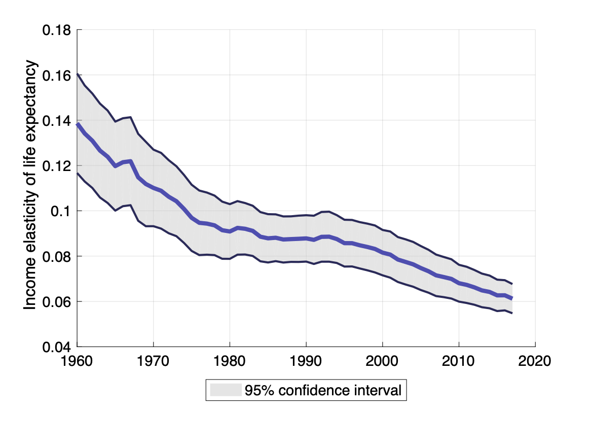
- Finally, the statistical correlation of life expectancy and GDP per capita across individual countries has been steadily declining since the 1960s, shown in the graph below. The FRED graph above is a manifestation of this decline.

How this graph was made: Search for and select “Life Expectancy at Birth, Total for Low income Countries.” From the “Edit Graph” panel, use the “Customize data” search field to search for and add the series “Life Expectancy at Birth, Total for High Income Countries” to the same line. In the formula bar, type a/b*100. Next, under the “Add Line” tab, search for and add “Constant GDP per capita for Low Income Countries” and “Constant GDP per capita for High Income Countries.” In the formula bar, type a/b*100.
Suggested by Guillaume Vandenbroucke.