Federal Reserve Economic Data: Your trusted data source since 1991

The FRED® Blog

Posts tagged with: "BAMLC0A4CBBBEY"

View this series on FRED

The equity premium

The equity premium is the difference between the return on a stock and the return on a bond. Typically, it’s positive—meaning stock returns are higher—although it can be negative when the stock market goes through some rough times. Over the long run, it’s definitively positive because bonds are senior to stocks in any liquidation: Bonds carry less risk and, therefore, less yield. Measuring the equity premium is tricky, though. To do it right, you must compare stocks and bonds from firms of similar quality and aggregate over many firms to smooth out anecdotal evidence and small-sample errors. Using broad indexes may also be distorting, as the firm composition may not be comparable between stock and bond indexes.

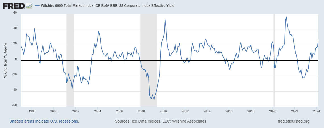
In the graph above, FRED shows one of the many examples of how you can measure the equity premium with available data, using here the very broad Wilshire 5000 index for stocks and the BofA Merrill Lynch BBB index for bonds. (BBB is a category that may be somewhat representative: not very safe but not very risky, either.) You can experiment on FRED with many other combinations. Again, you’ll find the result is positive most of the time, reflecting the simple investment advice that if saving for the long-run warrants a diversified portfolio of stocks.

How this graph was created: Search for “Wilshire 5000” and choose the total market index. Change units to “Percent Change from Year Ago.” In the “Edit Line” tab, add the second series by search for “BBB effective yield.” Customize the data by applying the formula a-b. Finally, change the frequency to monthly to make the graph less noisy.

Suggested by Christian Zimmermann.

View on FRED, series used in this post: BAMLC0A4CBBBEY, WILL5000IND

Bond yields shaken and/or stirred

Bond markets usually adhere to this logic: If a corporate bond is deemed to have a higher risk of default than another, it should have a higher return. Yet, bonds can deviate from this supposedly elementary wisdom. The graph shows yields for four grades of corporate bonds: AAA, AA, A, and BBB. Most of the time, their yields are ranked this way from bottom to top—but not always. There are two reasons for deviations. 1. The maturity composition, or the average maturity of the bonds, within each category can differ substantially. Indeed, yield is more than just risk; it’s also a reward for allowing cash to remain illiquid. 2. Many bonds have the option to be called (i.e., redeemed) before maturity, and the likelihood of this happening may differ across risk grades. In an environment where interest rates are expected to move, both of these situations can matter. The graph shows frequent deviations from the risk ratings for the AAA and AA bond pools. Occasionally the yield for AAA bonds even gets close to the yield for A bonds.

How this graph was created: Search for “US corporate effective yield” and select the series you want. Click on “Add to Graph.” Then order the series by risk rating using the “move up / move down” buttons at the bottom of the “Edit Data Series” tabs so that the legends are ordered appropriately.

Suggested by Christian Zimmermann

View on FRED, series used in this post: BAMLC0A1CAAAEY, BAMLC0A2CAAEY, BAMLC0A3CAEY, BAMLC0A4CBBBEY


Subscribe to the FRED newsletter


Follow us

Back to Top