Federal Reserve Economic Data: Your trusted data source since 1991

The FRED® Blog

Posts tagged with: "WILL5000IND"

View this series on FRED

Investing in FRED

FRED doesn’t provide advice on how you should invest your savings. Different circumstances warrant different portfolios; and, as we often hear, past performance is no guarantee of future results. But FRED can show how various forms of investment have performed over the past 40 years or so. Here, we compare stocks, gold, and real estate.

  • Stocks. There are many different stock indexes, but the Wilshire 5000 index is the most comprehensive. It shows the value of a portfolio of stocks with the dividends reinvested in that portfolio.
  • Gold. It doesn’t really matter which price index you use because they’re all very similar in the long run and there’s no dividend to account for.
  • Real estate. This is tricky, so we use two series: The Case-Shiller house price index captures the value of the house itself but not the (implicit) rent from it that could be reinvested in the same way dividends can be reinvested for stocks. The Wilshire index dedicated to real estate funds (REIT) does account for reinvestment.

The graph shows that, in the long-run, stocks and real estate are quite similar. But gold clearly lags and is similar to owning a house but not living in it or renting it out. Of course, in the short run, things can look different from this long-run picture and individual stocks or houses could perform differently from the big indexes.

How this graph was created: NOTE: Data series used in this graph have been removed from the FRED database, so the instructions for creating the graph are no longer valid. The graph was also changed to a static image.

Suggested by Christian Zimmermann.

View on FRED, series used in this post: CSUSHPINSA, GOLDPMGBD228NLBM, WILL5000IND, WILLREITIND

The equity premium

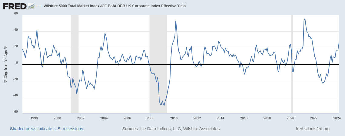
The equity premium is the difference between the return on a stock and the return on a bond. Typically, it’s positive—meaning stock returns are higher—although it can be negative when the stock market goes through some rough times. Over the long run, it’s definitively positive because bonds are senior to stocks in any liquidation: Bonds carry less risk and, therefore, less yield. Measuring the equity premium is tricky, though. To do it right, you must compare stocks and bonds from firms of similar quality and aggregate over many firms to smooth out anecdotal evidence and small-sample errors. Using broad indexes may also be distorting, as the firm composition may not be comparable between stock and bond indexes.

In the graph above, FRED shows one of the many examples of how you can measure the equity premium with available data, using here the very broad Wilshire 5000 index for stocks and the BofA Merrill Lynch BBB index for bonds. (BBB is a category that may be somewhat representative: not very safe but not very risky, either.) You can experiment on FRED with many other combinations. Again, you’ll find the result is positive most of the time, reflecting the simple investment advice that if saving for the long-run warrants a diversified portfolio of stocks.

How this graph was created: Search for “Wilshire 5000” and choose the total market index. Change units to “Percent Change from Year Ago.” In the “Edit Line” tab, add the second series by search for “BBB effective yield.” Customize the data by applying the formula a-b. Finally, change the frequency to monthly to make the graph less noisy.

Suggested by Christian Zimmermann.

View on FRED, series used in this post: BAMLC0A4CBBBEY, WILL5000IND


Subscribe to the FRED newsletter


Follow us

Back to Top