Federal Reserve Economic Data: Your trusted data source since 1991

The FRED® Blog

Posts tagged with: "FEDMINNFRWG"

View this series on FRED

Comparing the minimum wage with the average wage

You’ve likely seen discussions about the minimum wage in the news and in the FRED Blog. We’ve discussed

Today, we approach the topic from a different perspective. In the FRED graph above, the blue line tracks the fraction of the average weekly earnings for a person working full-time at the prevailing federal minimum wage. In other words, it shows how the minimum wage compares with the average wage.*

The blue line shoots upward every time Congress raises the federal minimum wage. And we have added a dashed custom line (in purple) to represent the average value of our calculation between January 1964 and January 2021. With a mean value of 44.45%, the hypothetical minimum-wage weekly earnings hit their high point of 57.39% of the average weekly earnings in February 1968. The low point in the graph was 33.47% in January 2021—the last available data at the time of this writing. For reference, the weekly earnings derived from a $15 per hour minimum wage (currently under discussion by policymakers) would amount to 69% of last month’s average weekly earnings.

*Specifically, the graph compares the average weekly earnings of production and nonsupervisory employees with the earnings of those who  work 40 hours per week at the federal minimum wage. The formula we use is (federal minimum hourly wage x 40 hours / average weekly earnings) x 100. Also keep in mind that minimum wage workers are part of the pool from which the average is taken.

How this graph was created: Search for and select “Federal Minimum Hourly Wage for Nonfarm Workers for the United States.” From the “Edit Graph” panel, use the “Edit Line 1” tab to customize the data by searching for and selecting “Average Weekly Earnings of Production and Nonsupervisory Employees, Total Private.” Next, create a custom formula to combine the series by typing in “((a*40)/b)*100” and clicking “Apply.” Next, use the “Add Line” tab to create a user-defined line. Create a line with start and end values of 44.45. To change the line colors, use the choices in the “Format” tab.

Suggested by Diego Mendez-Carbajo.

View on FRED, series used in this post: CES0500000030, FEDMINNFRWG

Calculating the value of women’s unpaid work

U.S. women's unpaid labor basically equals the state GDP of New York

Yesterday was International Women’s Day, so FRED is taking the opportunity to examine one economic contribution from women that’s often ignored: The value of women’s domestic labor that goes unpaid.

For this calculation, we use Oxfam’s methodology: We calculate the total amount of hours that women spend doing unpaid household work and then use the minimum wage to put a dollar value on that work: 

  1. Take the number of women above age 16 and multiply by 26.7 hours, which is, according to the Bureau of Labor Statistics, the average number of hours per week women spend on unpaid household work.
  2. Multiply this weekly value by 52, the number of weeks in a year.
  3. Multiply the result by the federal minimum wage.
  4. Divide this annual dollar amount by the consumer price index to adjust for inflation. (Note we use annual data here, aggregated at the end of each year, to make the graph easier to read.)

OK. Nice graph. But how big a number is this? To put it in context, let’s compare the value of women’s unpaid labor with all the economic activity recorded in the state of New York.


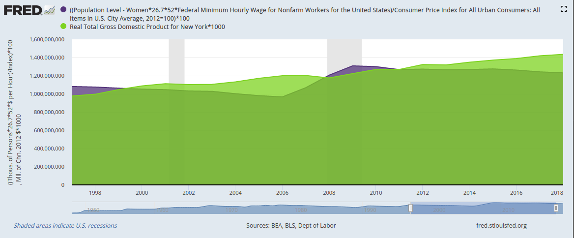
Customize | Download data

For 2018 (the most recent data available), the dollar value of women’s unpaid work in the U.S. was equal to 86% of all the economic activity recorded in the state of New York. In other years—say, the late 1990s and late 2000s—the value of women’s unpaid work even surpassed New York state GDP. And keep in mind this value is at the low end of the possible range because we use the federal minimum wage and not, for example, higher state minimum wages let alone market wages that correspond to the specific work being done.

How these graphs were created: For the first graph: Search for and select the population of women (series ID LNU00000002). From the “Edit Graph” panel, use “Edit Line”/”Customize data” to search for and add the series for the federal minimum wage (series ID FEDMINNFRWG) and CPI (series ID CPIAUCSL). Adjust frequency to annual. Apply formula ((a*26.7*52*b)/c)*100. From the “Format” tab, choose graph type “Area” and change the color to International Women’s Day purple. For the second graph: Start with the first graph. From the “Edit Graph” panel, adjust the units for CPI to 100 in 2012. Then use the “Add Line” tab to search for and select New York state GDP (series ID NYRGSP). Apply formula a*1000. Finally, adjust the sample period to a time when both series are available.

Suggested by Diego Mendez-Carbajo.

View on FRED, series used in this post: CPIAUCSL, FEDMINNFRWG, LNU00000002

The value(s) of the minimum wage

The minimum wage, which has been in the news recently, seems to be part of two related but slightly different concerns. One is earnings inequality, which a higher minimum wage could potentially reduce. The other is poverty, which a higher minimum wage could also potentially reduce by helping a low-income worker afford a basic basket of goods. Putting aside the ability of the minimum wage to achieve either of these two goals (which economists actively debate), we still have these two different ways to measure the minimum wage and how it has evolved.

To quantify the purchasing power of the minimum wage, we can simply deflate the nominal value of the minimum wage. The red line shows the value of the federal minimum wage deflated by the PCE price index. We might be equally interested in whether the minimum wage pushes up the bottom of the wage distribution: How the minimum wage affects wage inequality is related to where it lands in the wage distribution. The blue line shows the fraction of hourly workers whose wages are at or below the minimum wage. This measures the value of the minimum wage by showing how many workers are directly affected by it.

The red line shows the minimum wage drifting up and down as its nominal value is eroded by inflation and as it is legislatively adjusted. The blue line shows it drifting downward consistently for the whole period as it fails to keep up with the growth in wages of most of the distribution.

How this graph was created: Search for “percent paid minimum wage” and add the annual series to the graph. Add the second series to the graph by searching for “federal minimum wage” and adding it as series 2. Then add “Personal Consumption Expenditures: Chain-type Price Index” by selecting “Modify existing series 2.” Finally, use the “Create your own data transformation” to apply the formula 100*a/b. (You need to multiply by 100 as the PCE index is normalized at 100.)

Suggested by David Wiczer.

View on FRED, series used in this post: FEDMINNFRWG, LEU0203127200A, PCECTPI


Subscribe to the FRED newsletter


Follow us

Back to Top