Federal Reserve Economic Data

The FRED® Blog

Posts tagged with: "GOLDPMGBD228NLBM"

View this series on FRED

Investing in FRED

FRED doesn’t provide advice on how you should invest your savings. Different circumstances warrant different portfolios; and, as we often hear, past performance is no guarantee of future results. But FRED can show how various forms of investment have performed over the past 40 years or so. Here, we compare stocks, gold, and real estate.

  • Stocks. There are many different stock indexes, but the Wilshire 5000 index is the most comprehensive. It shows the value of a portfolio of stocks with the dividends reinvested in that portfolio.
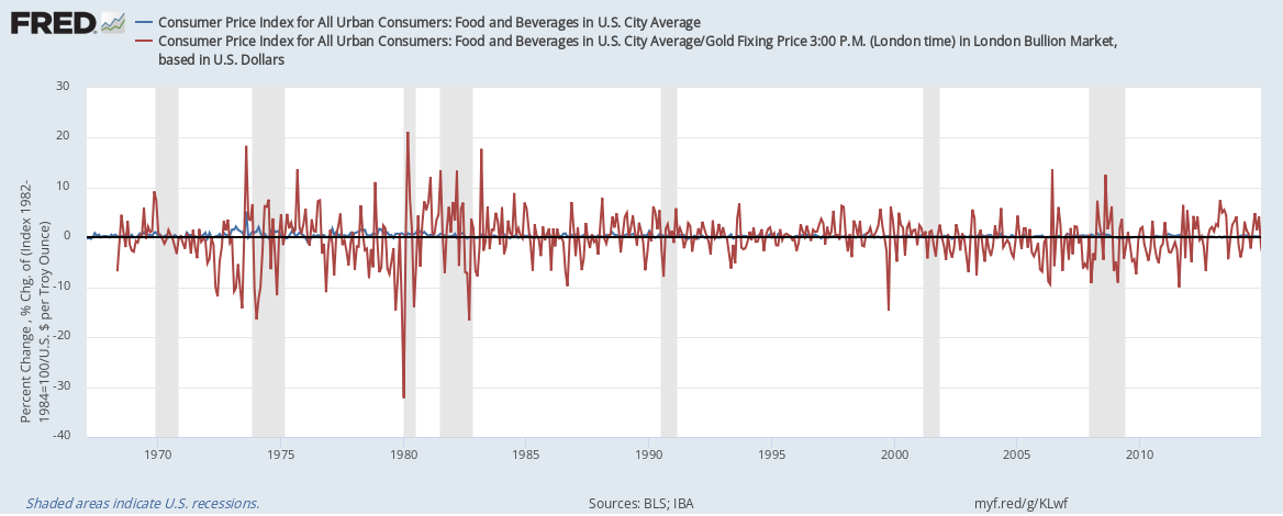
  • Gold. It doesn’t really matter which price index you use because they’re all very similar in the long run and there’s no dividend to account for.
  • Real estate. This is tricky, so we use two series: The Case-Shiller house price index captures the value of the house itself but not the (implicit) rent from it that could be reinvested in the same way dividends can be reinvested for stocks. The Wilshire index dedicated to real estate funds (REIT) does account for reinvestment.

The graph shows that, in the long-run, stocks and real estate are quite similar. But gold clearly lags and is similar to owning a house but not living in it or renting it out. Of course, in the short run, things can look different from this long-run picture and individual stocks or houses could perform differently from the big indexes.

How this graph was created: NOTE: Data series used in this graph have been removed from the FRED database, so the instructions for creating the graph are no longer valid. The graph was also changed to a static image.

Suggested by Christian Zimmermann.

View on FRED, series used in this post: CSUSHPINSA, GOLDPMGBD228NLBM, WILL5000IND, WILLREITIND

What if we priced food in gold?

Imagine paying for food not in dollars, but in gold. How different would the world be? The graph above is an attempt to depict the difference it would make to food prices. Taking the subcategory “food and beverages” in the consumer price index, we compare the price in dollars (in blue) with the price in gold (in red). The graph shows month-to-month percentage price changes. The price in gold is calculated by dividing the price index by the price of gold in dollars. The graph makes very apparent that, if we priced food in gold, there would be wild fluctuations in those food prices. Consider the units on the vertical axis: Prices change several percent in either direction from one month to the next. But would price fluctuations really be that wild? Probably not, as it’s costly for sellers to change prices (“menu costs”) and they would make those changes less frequently than the graph shows. Yet, the essential premise remains: The Fed has a mandate to keep prices (in dollars) stable, which it can do by managing the money supply. Such stability is not possible with the gold supply. It is thus unavoidable that gold-based prices would fluctuate more. How this graph was created: NOTE: Data series used in this graph have been removed from the FRED database, so the instructions for creating the graph are no longer valid. The graph was also changed to  a static image. Suggested by Christian Zimmermann
View on FRED, series used in this post: CPIFABSL, GOLDPMGBD228NLBM


Subscribe to the FRED newsletter


Follow us

Back to Top