FRED makes it easy to create a stacked area graph of GDP components using our new release view feature:
How this graph was created: Navigate to the gross domestic product release page using the “Releases” link on the FRED homepage. Choose “Gross Domestic Product” (page 2) and then click on the “Section 1 – Domestic Product and Income” release link. Select Table 1.1.5 and then select the “Quarterly” series (they’re all quarterly). Now you have reached the components of GDP, and the page will look like this:
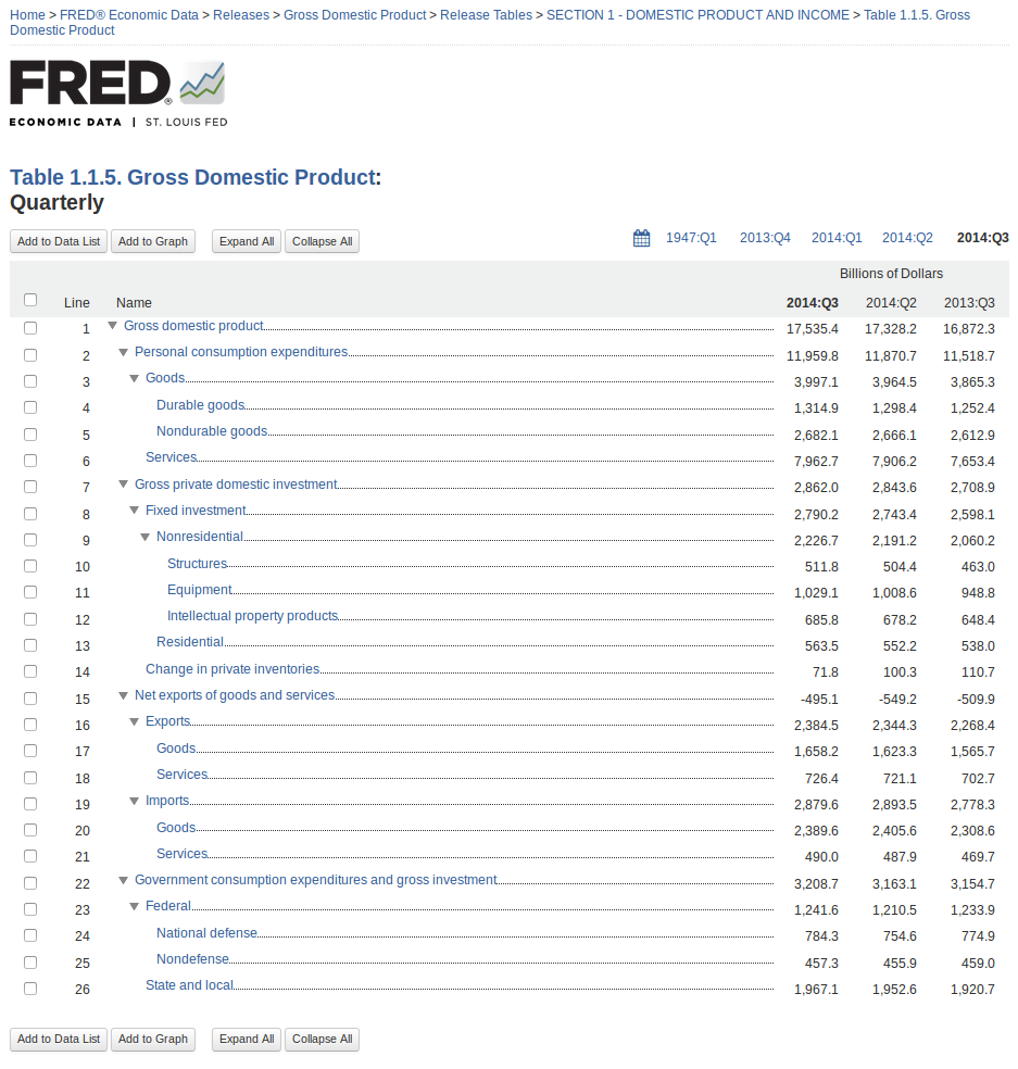
From here, you can easily see the components of GDP as a hierarchy with the latest value, the previous period’s value, and the value from a year ago. Check the boxes next to personal consumption expenditures, gross private domestic investment, net exports of goods and services, and government consumption expenditures and gross investment. Then click the “Add to Graph” button.
You’ll see a line graph of the four series. Under the graph tab, expand the “Graph Settings” menu. Change the graph type to “Area” and the stacking to “Normal.” Finally, so that net exports are easier to see, expand the menu for that series and click the “move down” button.
Suggested by Keith Taylor