Federal Reserve Economic Data: Your trusted data source since 1991

The FRED® Blog

Posts tagged with: "NETEXP"

View this series on FRED

The business behind the trade balance

Why trade deficits decrease in recessions and increase in booms

How does the trade balance relate to economic activity? The graph above shows the U.S. trade balance for goods and services as a percentage of GDP. Obviously, there was a surplus initially and now there’s a persistent deficit. Beyond that, it looks like every time there’s a recession, the trade deficit tends to decrease. (Or, if we go farther back in the past, the trade surplus tends to increase.) Obviously, many things affect the trade balance, but let’s see what FRED can show us about this relationship.

A good way to reveal how series may be correlated is to look at scatter plots. Instead of relating economic data to dates, scatter plots relate two data series to each other, one on each axis. The graph above does this with changes to the trade balance ratio on one axis and percent changes to real GDP on the other axis. What may look like a random assortment of dots actually has some information. Imagine the graph is divided into four quadrants and then consider where the dots are located. The upper right and lower left quadrants have fewer data points than the other two, highlighting that there is indeed a negative correlation: That is, when real GDP tends to increase, the trade balance tends to decline—that is, trade surpluses decrease or trade deficits increase.

Why is that? First, consider that the trade balance is net exports—that is, exports minus imports. Imports are highly correlated with GDP, while exports are less so. We see this in the graph above, which plots imports. This time, the upper left and lower right quadrants are the most populated. This highlights the positive correlation: That is, when real GDP tends to increase, imports do as well. Thus, over the business cycle, it is really imports that drive the trade balance: When the economy is doing well, producers need more intermediate goods, and imports are mostly intermediate goods. Also households consume more, and a share of those consumption goods are imports. If you graph exports, the correlation is much harder to see. Exports depend much more on what happens abroad, which isn’t that well correlated with domestic activity.

How these graphs were created: First graph: Search for “net exports” and select the quarterly series. From the “Edit Graph” panle, add GDP and apply formula a/b*100. Second graph: Use the first graph and change the sample period to start in 1954. From the “Edit Graph” panel, change the units to “Change.” Add a line by searching for “real GDP,” change its units to “Percent change,” open the “Format” tab, and switch the type to “Scatter.” Third graph: Use the second graph but with real imports in percent change.

Suggested by Christian Zimmermann.

View on FRED, series used in this post: GDP, GDPC1, IMPGS, NETEXP

Do imports subtract from GDP?

A basic explanation of GDP = C + I + G + (X-M)

The typical textbook treatment of GDP is the expenditure approach, where spending is categorized into the following buckets: personal consumption expenditures (C); gross private investment (I); government purchases (G); and net exports (X – M), composed of exports (X) and imports (M). Textbooks often capture this in one relatively simple equation:

GDP = C + I + G + (X – M).

Notice that, here, imports (M) are subtracted. On the surface, this implies that an extra dollar of spending on imports (M) will decrease GDP by one dollar. For example, let’s assume you spend $30,000 on an imported car; because imports are subtracted (e.g., “– M”), the equation seems to imply that $30,000 should be subtracted from GDP. However, this cannot be correct because GDP measures domestic production, so imports (foreign production) should have no impact on GDP.

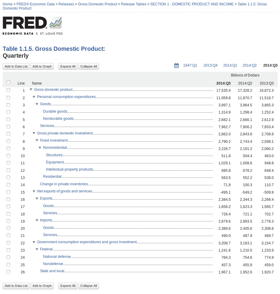
When the Bureau of Economic Analysis (BEA; see its primer on this topic) measures economic output, it categorizes spending with the National Income and Product Accounts (NIPA). Some of this spending (which is counted as C, I, and G) is spent on imported goods. As such, the value of imports must be subtracted to ensure that only spending on domestic goods is measured in GDP. For example, $30,000 spent on an imported car is counted as a personal consumption expenditure (C), but then the $30,000 is subtracted as an import (M) to ensure that only the value of domestic production is counted. As such, the imports variable (M) functions as an accounting variable rather than an expenditure variable. To be clear, the purchase of domestic goods and services increases GDP because it increases domestic production, but the purchase of imported goods and services has no direct impact on GDP.

The misconception that imports reduce GDP also seems to be implied when the GDP components are stacked using the FRED release view. Notice that the green “net exports” area is negative. This occurs because the dollar value of imported goods and services exceeds the value of exported goods and services. While this aspect of net exports (X – M) is useful for evaluating how international trade affects economic activity, it can be misleading. Like the misleading aspects of the expenditure equation, it suggests (visually) that imports reduce overall GDP. While the graph is not incorrect, it is important to keep in mind that, when calculating GDP, the value of imports is actually subtracted from the other components of GDP (personal consumption expenditures, gross private domestic investment, government consumption expenditures, and gross investment), not exports. Again, it’s important to emphasize that the imports variable (M) is an accounting variable rather than an expenditure variable.

To learn how to create your own GDP stacking graph, see this FRED blog post. For a more complete description of GDP and the expenditures equation, read the September 2018 issue of Page One Economics.

Suggested by Scott Wolla.

View on FRED, series used in this post: GCE, GPDI, NETEXP, PCEC

Graphing GDP components with our new release view

FRED makes it easy to create a stacked area graph of GDP components using our new release view feature:

How this graph was created: Navigate to the gross domestic product release page using the “Releases” link on the FRED homepage. Choose “Gross Domestic Product” (page 2) and then click on the “Section 1 – Domestic Product and Income” release link. Select Table 1.1.5 and then select the “Quarterly” series (they’re all quarterly). Now you have reached the components of GDP, and the page will look like this:

Screenshot from 2014-11-20 15:13:17

From here, you can easily see the components of GDP as a hierarchy with the latest value, the previous period’s value, and the value from a year ago. Check the boxes next to personal consumption expenditures, gross private domestic investment, net exports of goods and services, and government consumption expenditures and gross investment. Then click the “Add to Graph” button.

You’ll see a line graph of the four series. Under the graph tab, expand the “Graph Settings” menu. Change the graph type to “Area” and the stacking to “Normal.” Finally, so that net exports are easier to see, expand the menu for that series and click the “move down” button.

Suggested by Keith Taylor

View on FRED, series used in this post: GCE, GPDI, NETEXP, PCEC


Subscribe to the FRED newsletter


Follow us

Back to Top