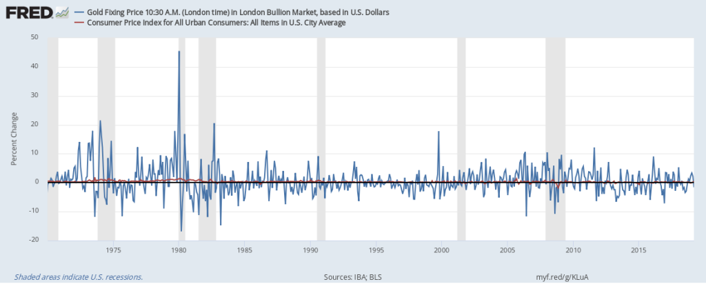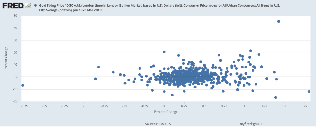
According to conventional wisdom, holding gold is a good way to protect oneself against inflation. But let’s try to understand this wisdom a little better with the help of some FRED graphs. The graph above simply shows the monthly general inflation rate (from the CPI) and the monthly gold inflation rate. But this line graph doesn’t offer a very clear picture: The fluctuations in the price of gold are much larger than those for prices in general. So, instead, let’s try a scatter plot, shown below, where every point corresponds to a particular month and its pair of inflation rates. But, again, there’s not much to see here.

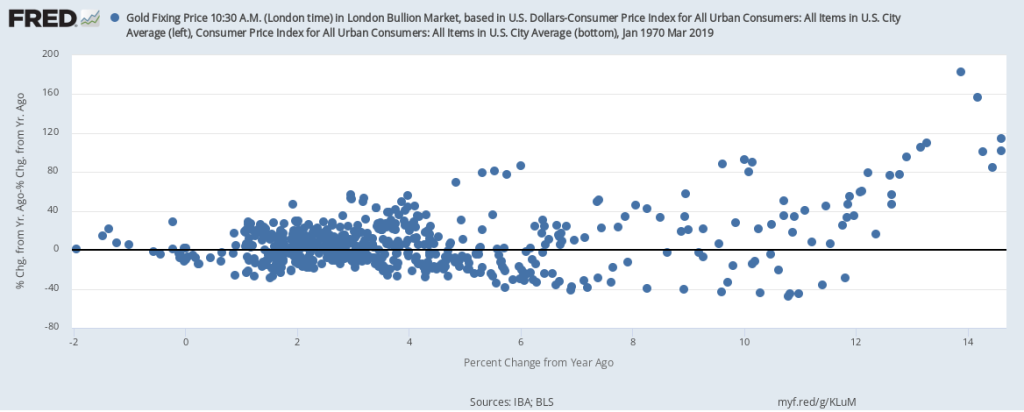
Now you may be asking, isn’t it true that, if the general price level is rising, so is the price of gold? To really measure how gold has appreciated, then, we need to remove CPI inflation from gold inflation. The resulting scatter plot is below. Not much of a difference, unfortunately, mostly because there’s not much variation in CPI inflation compared with the variation in gold inflation. (Compare the different ranges on each axis.)

OK. Last try. In the graph below, we switch from monthly inflation to yearly inflation for both measures. And, again, there’s not much of a relationship to see here except when CPI inflation is really high—on the right side of the plot. There, higher CPI inflation is indeed associated with high gold inflation. But this is statistically tenuous because it’s based on only a few data points.

By the way, the practice of massaging the data in many ways is called data mining. Showing only the particular combination that worked out while hiding all the specifications that did not is not considered good research practice.
How these graphs were created: NOTE: Data series used in these graphs have been removed from the FRED database, so the instructions for creating the graphs are no longer valid. The graphs were also changed to static images.
Suggested by Christian Zimmermann.

