FRED’s as good as gold, and the FRED Blog has used London Bullion Market Association data to prove it. In fact, our previous post tracks gold prices and appraises the new gold bar at the St. Louis Fed. Now these gold prices are quoted in three different currencies—U.S. dollars, British pounds, and euros—which is a golden opportunity to discuss arbitrage.
Arbitrage is the risk-free purchase and sale of an asset to profit from a difference in price across markets. Because the gold fixing price is quoted in three different currencies at once, it’s possible that one could make a profit by buying and selling gold in different currencies and then selling the currencies. For example: buy gold in U.S. dollars, sell the gold right away in British pounds, and then convert the pounds back to dollars in the foreign exchange market.
FRED can help us visualize this shiny concept: In the graph above, we show the ratio of the gold fixing price in U.S. dollars to the gold fixing price in British pounds. Then we graph the exchange rate between the U.S. dollar and the British pound. The two lines seem identical, so there’s no obvious arbitrage opportunity here.
But let’s dig deeper by building another FRED graph to show the difference between the U.S. dollar/British pound gold fixing price ratio and the exchange rate between the two currencies. If there really is no arbitrage opportunity, the graph should show a flat horizontal line at the zero mark.
This doesn’t look like a flat line, so did we find treasure?! Sadly, no. The graph shows differences in gold fixing prices between currencies, but they are extremely small and volatile. So small they’d likely be wiped out by transaction costs, such as brokerage fees in the precious metals and/or foreign currency markets. Rather than a gold mine, we seem to have found just some gold dust.
How these graphs were created: NOTE: Data series used in these graphs have been removed from the FRED database, so the instructions for creating the graphs are no longer valid. The graphs were also changed to static images.
Suggested by Diego Mendez-Carbajo.
No. This isn’t the plot of a National Treasure sequel. It’s the latest addition to the St. Louis Fed’s Economy Museum: a 9.75” long, 1.5” tall bar of gold on loan from the Mint. Because the bar is 99.999% pure gold, it weighs 28 pounds! So, how much does a 28-pound gold bar cost?
Let’s use FRED data to figure out the price of this bar, which is on display, coincidentally, right across from the museum’s FRED exhibit.
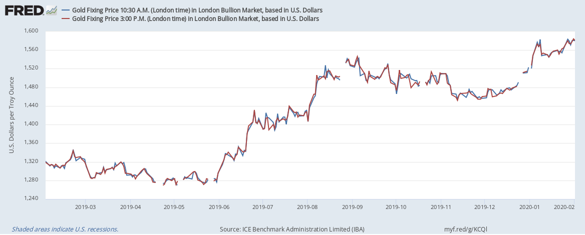
Although some people see gold as a hedge against inflation, the graph above shows just how volatile the price of gold can be. Here, we have the “fixing price” of a troy ounce of gold in U.S. dollars in the London bullion market. London is the largest trading center for precious metals, and gold prices are reported daily at two different times (10:30 AM and 3:00 PM London time) to account for these intra-day variations.
Sorry, but now we have to do some math. There are 14.5833 troy ounces in a pound, and the museum’s gold bar weighs 28 pounds. That’s 408.3324 troy ounces. Much like gold, FRED is very malleable; so we can customize the data to reveal the price of the entire bar. In the graph below, we’ve applied the formula a * 408.3324. Clearly, changes in global supply and demand affect the price. And, between January 1 and February 10, 2020, the price of the bar has ranged from $623,564.41 to $646,880.19.
If you visit the Economy Museum, you’ll have the chance to try to lift this bar yourself. Before you visit, though, you may want to eat your spinach: 28 pounds is no small weight. Speaking of, the bar is literally worth its weight in gold, but what about its weight in cash? At its highest, the price of the gold bar would be a little more than 14 pounds of (mostly) $100 bills. If, you’re interested, the formula $646,880.19 / $100 * 1 gram/bill * 0.00220462 pound/gram gets you there.
By the way, FRED fans: The Economy Museum also sells FRED t-shirts! Unfortunately, we have no price or weight data for those…
How these graphs were created: NOTE: Data series used in these graphs have been removed from the FRED database, so the instructions for creating the graphs are no longer valid. The graphs were also changed to static images.
Many data series in FRED are versatile enough to be viewed in different ways. We’ve offered two perspectives so far on CO2 emissions at the national level. Today, we offer another perspective—emissions at the state level—thanks to GeoFRED. The map above shows total emissions for each continental U.S. state. These numbers depend on the number of residents, types of economic activity, and types of fuel used. So it’s no surprise that the most populous states are the ones emitting the most carbon dioxide, with the possible exception of Louisiana.
Emissions from coal show something different. For example, the largest state, California, actually has one of the lowest coal-related emission levels. The relatively smaller states of Michigan, Missouri, and West Virginia, on the other hand, rank among the highest in coal-related emissions, which is a reflection of the fuel these states use for power generation.
Emissions from natural gas complement those from coal: That is, states with surprisingly low emissions from coal have higher emissions from natural gas (and vice versa). Louisiana has high emissions from natural gas, just as it does from petroleum, which is shown in our last map. While petroleum is used all over the country for transportation, extracting and refining it also requires a lot of petroleum, hence the higher emissions in oil-producing states.
How these maps were created:The original post referenced interactive maps from our now discontinued GeoFRED site. The revised post provides replacement maps from FRED’s new mapping tool. To create FRED maps, go to the data series page in question and look for the green “VIEW MAP” button at the top right of the graph. See this post for instructions to edit a FRED map. Only series with a green map button can be mapped.