Federal Reserve Economic Data: Your trusted data source since 1991

The FRED® Blog

Posts tagged with: "CPIAUCNS"

View this series on FRED

Does oil drive inflation?

A look at oil's influence over producer prices vs. consumer prices

The price of oil has declined recently, but does that mean prices overall have declined? Let’s see if FRED can help us measure how much connection there is between oil prices and the general price level. The graph above compares oil price inflation and overall price inflation in the U.S. over recent decades. The red and blue lines plot the year-to-year inflation rate corresponding to two of the major aggregate price indexes: the producer price index (PPI) and the consumer price index (CPI). The green and purple lines plot the year-to-year percentage change in two of the major global oil price indexes: the price of Brent crude and the price of West Texas Intermediate (WTI) crude.

The graph shows a strong positive relationship between oil prices and PPI inflation: That is, higher oil prices are associated with higher producer prices and vice versa. Specifically, the correlation between oil prices and the PPI is 0.71. This strong link likely comes from the importance of oil as an input in the production of goods. In contrast, the graph shows a positive but much weaker relationship between oil prices and CPI inflation: The correlation is 0.27, much lower than for producer prices. This weaker link between oil prices and consumer prices likely comes from the relatively higher weight of services in the U.S. consumption basket, which you’d expect to rely less on oil as a production input. If you know what to look for, this difference in correlation is more clearly visible in the scatter plot below: The red dots (PPI and oil) more or less follow a 45-degree line that rises from left to right, which translates into a strong positive relationship between PPI and oil prices. The stream of blue dots (CPI and oil) doesn’t strictly follow a 45-degree line, which reveals a much weaker relationship.

How these graphs were created: Search for “CPI” and click on the series name. From the “Edit Graph” panel, open the “Add Line” tab and search for “PPI,” then click on the series name. Repeat this procedure searching for “oil price” to add the remaining series. From the “Format” tab: Set the “y-axis” position corresponding to the oil price series to “right,” set the “Graph frame” color to white, and set the thickness of each of the lines to 3. For the second graph, from the “Format” tab, change the graph type to “Scatter.”

Suggested by Fernando Leibovici.

View on FRED, series used in this post: CPIAUCNS, POILBREUSDQ, POILWTIUSDQ, PPIACO

How expensive is it to service the national debt?

A battle between interest rates and growth rates

The U.S. federal debt has been rising steadily since the Great Recession and is currently 103 percent of GDP. So let’s enlist FRED to help us study the sustainability of this debt by looking at how much it costs to service it.

Neil Mehrotra recently described the cost of servicing public debt as dependent on the gap between the real interest rate on debt and the growth rate of real GDP: This gap captures the difference between the interest the government must pay to its lenders, in real terms, and the pace at which U.S. income increases. If U.S. income increases more rapidly, then interest payments on U.S. debt shouldn’t be a major burden.

The graph plots this measure of the cost of servicing the debt. (Here, the growth rate of real GDP is the sum of real GPD per capita growth and population growth, and the real interest rate is the difference between the interest rate on a 10-year Treasury bond and the CPI inflation rate.) The graph presents an interesting picture. In the years since the Great Recession, the cost of servicing public debt has been negative, which means that the burden of U.S. public debt is low. Since 1960, negative debt servicing costs have occurred nearly 63 percent of the time; and the average cost of servicing debt is -0.67%. In fact, since the 1960s, the only time period in which the real interest rate was consistently greater than the growth rate of real GDP was from 1981 to 1995.

Interest rates have been low since the previous recession, but they have been on an upward trajectory lately, which may increase the cost of servicing the federal debt.

How this graph was created: Search for and select the series “Constant GDP per capita for the United States.” From the “Edit Graph” panel, set the frequency to “Annual.” Then add three more series in this order to the same line: “Population Growth for the United States,” “10-Year Treasury Constant Maturity Rate,” and “Consumer Price Index for All Urban Consumers” (all at anual frequencies). Set the units for constant GDP per capita to “Percent Change from Year Ago” and the units for CPI inflation to be “Percent Change.” Then, in the Formula bar, enter the formula c-d-a-b.

Suggested by Asha Bharadwaj and Maximiliano Dvorkin.

View on FRED, series used in this post: CPIAUCNS, GS10, NYGDPPCAPKDUSA, SPPOPGROWUSA

All that glitters is not necessarily a good store of value

The evolution of precious and not-so-precious metal prices

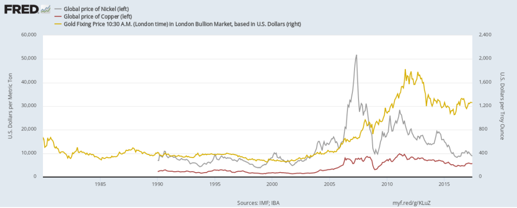
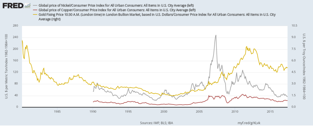
The FRED team is busy adding new data almost every day, as new data are released almost every day. That includes the week between Christmas and the new year. Still, we found some time to create this FRED graph, which shows the prices of gold, copper, and nickel. You may have noticed the colors of the lines match the colors of their metals, thanks to FRED’s flexible graph formatting tool. Note also that we displayed the price of gold on a different scale, as it’s an order of magnitude or two higher than the others. The prices of these metals, as is often the case with commodities, are quite volatile. There seems to be a connection between the price of copper and the price of nickel: Both, for example, are used as an alloy in the manufacture of coins. But the price of gold seems to follow its own laws. At any rate, none of these metals instills confidence that its price is certain to appreciate, despite what some advertisements claim. This lack of certainty becomes even more apparent when you adjust for inflation, as shown in the graph below.
How this graph was created: NOTE: Data series used in these graphs have been removed from the FRED database, so the instructions for creating the graphs are no longer valid. The graphs were also changed to static images. Suggested by Christian Zimmermann.
View on FRED, series used in this post: CPIAUCNS, GOLDAMGBD228NLBM, PCOPPUSDM, PNICKUSDM


Subscribe to the FRED newsletter


Follow us

Back to Top