If you’re a renter and have been complaining that your rent keeps rising, the statistics seem to back you up. In the graph, the purple line shows the evolution of rents in the U.S. as a whole, while the light blue line shows the general price level (CPI). Clearly, rents are increasing faster than prices overall. Of course, location matters for anything related to housing, and there are large regional differences: Rents in the New York and San Francisco areas have clearly appreciated more than average. Rents in the Detroit area have increased but well below the average rate; still, they’re keeping up with general inflation.
Note, however, that the graph shows the evolution of rents, but not their level. It shouldn’t be too surprising that rents in 1984 (the beginning of this sample) were higher in New York and San Francisco than in Detroit. And that gap has increased even more over time.
How this graph was created: Search for “rent CPI CBSA” (which stands for core-based statistical area, a metropolitan area defined around a core) and select the area you want shown. We selected semi-annual data instead of monthly, as these data are not collected every month. Click on “Add to Graph.” Add the remaining two series the usual way: From the “Edit Graph” panel, open the “Add Line” tab, search for “rent CPI” and add it, then search for “CPI” and add it. The last step is to limit the sample period to start on 1984-01-01.
Is it worth it to buy 1-month Treasury bills? The above FRED graph shows their returns in recent years: While they often get very close to zero, at least they’re positive.* But “positive” may not count for much since we have to account for inflation. So let’s redo the graph by subtracting inflation from the return.
This exercise isn’t as simple as it might appear: First, we must factor-in inflation over the life of the bill, which is shorter than the period in which inflation is typically reported. Second, the Treasury return that’s reported in the data is annualized, meaning the monthly return is compounded to an annual return.
So here’s what we need to do to the CPI:
Take the percent change from the previous month, to match the maturity of the (1-month) bill
Divide it by 100, to get rid of the % units
Add 1, to prepare for compounding
Take the power of 12, to compound for one full year (to match the annualized Treasury rate)
Remove 1
Multiply by 100 to express it back in % units
Subtract the result from the Treasury rate
The result shows that the real return on the 1-month Treasury bill is very often negative. But simply holding on to your money would have been worse, as money is notorious for earning no interest whatsoever.
*In December 2011, the nominal return actually hit 0.00%.
How these graphs were created: For the first graph, search for “one month Treasury” and select the monthly series. For the second graph, take the first, go to the “Edit Graph” panel, add the CPI series, change its units to “Percent Change,” and apply formula a-((1+b/100)^12-1)*100.
According to conventional wisdom, holding gold is a good way to protect oneself against inflation. But let’s try to understand this wisdom a little better with the help of some FRED graphs. The graph above simply shows the monthly general inflation rate (from the CPI) and the monthly gold inflation rate. But this line graph doesn’t offer a very clear picture: The fluctuations in the price of gold are much larger than those for prices in general. So, instead, let’s try a scatter plot, shown below, where every point corresponds to a particular month and its pair of inflation rates. But, again, there’s not much to see here.
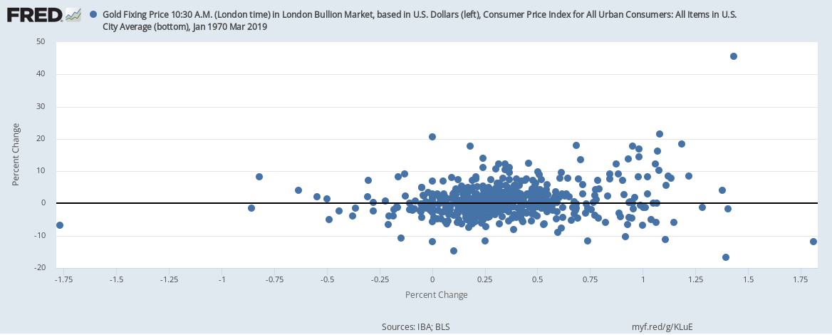
Now you may be asking, isn’t it true that, if the general price level is rising, so is the price of gold? To really measure how gold has appreciated, then, we need to remove CPI inflation from gold inflation. The resulting scatter plot is below. Not much of a difference, unfortunately, mostly because there’s not much variation in CPI inflation compared with the variation in gold inflation. (Compare the different ranges on each axis.)
OK. Last try. In the graph below, we switch from monthly inflation to yearly inflation for both measures. And, again, there’s not much of a relationship to see here except when CPI inflation is really high—on the right side of the plot. There, higher CPI inflation is indeed associated with high gold inflation. But this is statistically tenuous because it’s based on only a few data points.
By the way, the practice of massaging the data in many ways is called data mining. Showing only the particular combination that worked out while hiding all the specifications that did not is not considered good research practice.
How these graphs were created: NOTE: Data series used in these graphs have been removed from the FRED database, so the instructions for creating the graphs are no longer valid. The graphs were also changed to static images.