Federal Reserve Economic Data

The FRED® Blog

All that glitters is not necessarily a good store of value

The evolution of precious and not-so-precious metal prices

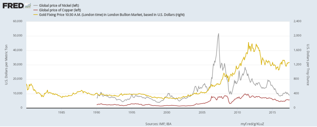
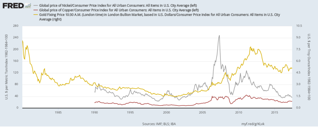
The FRED team is busy adding new data almost every day, as new data are released almost every day. That includes the week between Christmas and the new year. Still, we found some time to create this FRED graph, which shows the prices of gold, copper, and nickel. You may have noticed the colors of the lines match the colors of their metals, thanks to FRED’s flexible graph formatting tool. Note also that we displayed the price of gold on a different scale, as it’s an order of magnitude or two higher than the others. The prices of these metals, as is often the case with commodities, are quite volatile. There seems to be a connection between the price of copper and the price of nickel: Both, for example, are used as an alloy in the manufacture of coins. But the price of gold seems to follow its own laws. At any rate, none of these metals instills confidence that its price is certain to appreciate, despite what some advertisements claim. This lack of certainty becomes even more apparent when you adjust for inflation, as shown in the graph below.
How this graph was created: NOTE: Data series used in these graphs have been removed from the FRED database, so the instructions for creating the graphs are no longer valid. The graphs were also changed to static images. Suggested by Christian Zimmermann.
View on FRED, series used in this post: CPIAUCNS, GOLDAMGBD228NLBM, PCOPPUSDM, PNICKUSDM

Busting a Santa myth

How hard are the elves working?

We’ve all heard that Santa and his elves are wildly busy, especially through December, making toys and other gifts for the Christmas season. Can FRED tell us anything about how busy they are? As it turns out, FRED does have quite a bit of employment data on Santa’s neighborhood: Alaska! (Which includes the town of North Pole!)

Given the quantity of gifts distributed on Christmas eve and the size of Alaska’s economy, we reckon that Santa’s enterprise is a major player and that Alaska’s economy is a good proxy for what’s happening in Santa’s shop.

We’re sorry to say that Alaska’s employment data do not corroborate the story that Santa and his elves keep busy in December. The graph above shows the total number of employees in Alaska’s private businesses. This measure excludes government employees, but it’s reasonable to assume Santa isn’t part of the government.

What’s really striking about this graph is the strong seasonal pattern. Significantly more people work in some months than in others, and the differences aren’t small: There’s a 20% difference between the top and bottom in each year. If you look closely (either by shortening the sample size or by hovering over the graph), you see that January has the least employees, which is expected, since Santa has just finished the deliveries and is likely on vacation with the elves. But the top months are all in the summer. This means the elves aren’t scrambling right before Christmas, but instead have planned their production well ahead of time. The graph below tells a similar story, in that weekly hours worked follows the same pattern as the employment measure: They actually bottom out every December.

In conclusion, the story that elves are overworked making toys right up to Christmas is simply a myth.

How these graphs were created: Search for “Alaska private employment,” and both series will be among the choices. Choose on the monthly, not seasonally adjusted series.

Suggested by Christian Zimmermann.

View on FRED, series used in this post: SMU02000000500000001, SMU02000000500000002

Houses, up and down

An international comparison of house price movement

We recently highlighted state-by-state comparisons of house price appreciation. Today, we’re going international. Thanks to the Bank for International Settlements, we have residential property prices for a selection of countries, in both nominal and real terms. Here we focus on the latter, which show how house prices evolve compared with other prices. We also focus on countries with relatively long sample periods so we can document long-term trends.

The graph above shows data for a set of countries where houses have significantly appreciated over the long haul. It’s not a steady trend (e.g., Hong Kong) and doesn’t last through the whole period (e.g., the U.K.’s “weak” property market over the past 10 years); these patterns highlight the adage that past behavior isn’t necessarily a good predictor of future behavior. The graph below shows a different set of countries where the long-term trend is more mixed, even downward facing. The U.S. is part of this group with its distinct “bubble” that the housing market is still recovering from. Switzerland is surprisingly stagnant despite strong population growth, and Korea is even trending down.

How these graphs were created: Search for “BIS house price,” then click the “real” tag in the side bar. Check the series you want shown, and click “Add to Graph.”

Suggested by Christian Zimmermann.

View on FRED, series used in this post: QCAR628BIS, QCHR628BIS, QGBR628BIS, QHKR628BIS, QKRR628BIS, QNZR628BIS, QUSR628BIS, QZAR628BIS


Subscribe to the FRED newsletter


Follow us

Back to Top