Federal Reserve Economic Data

The FRED® Blog

Alternative money for transactions

What if gold or Bitcoin replaced the dollar?

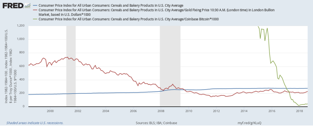
What if U.S. retail prices were not denominated in U.S. dollars, but instead were denominated in gold or Bitcoin? Paying for a loaf of bread with gold wouldn’t be very practical, as you’d need a very small speck of the precious metal. But one can imagine a system of gold substitutes, such as notes giving you ownership of a fraction of an ounce of gold, thereby overcoming the small-change problem. With Bitcoin, it’d be much easier, as a virtual currency can be divided any way you want. Now, let’s look at actual prices. FRED doesn’t have price data on just a loaf of bread, but it does have the consumer price index for cereals and bakery products, so let’s use that. The blue line shows the evolution of the U.S. dollar price of a basket of baked goods. The red line shows the price in gold, and the green line shows the price in Bitcoin. It’s apparent that the dollar price is much more stable and has slowly increased over time. The gold price has considerable fluctuations from month to month. While the gold price seems to have a tendency to decrease, this isn’t always true, which you can see if you enlarge the sample window. As for Bitcoin, the fluctuations are extreme, even when you restrict the sample period to the past year. What’s behind the differences? The Fed’s mandate is to stabilize prices as expressed in U.S. dollars, and this is quite apparent in this graph. The Fed does this by adapting to changes in the demand for dollars. That isn’t possible with gold, as its supply is determined by worldwide mining success, which is outside of the control of any institution. The same applies to Bitcoin, with the additional constraint that mining success keeps dwindling. How this graph was created: NOTE: Data series used in this graph have been removed from the FRED database, so the instructions for creating the graph are no longer valid. The graph was also changed to a static image. Suggested by Christian Zimmermann.
View on FRED, series used in this post: CBBTCUSD, CUSR0000SAF111, GOLDAMGBD228NLBM

The components of GDP growth

What's driving the second quarter's 4.1% gain?

On July 27, the Bureau of Economic Analysis released its “advance” estimate of GDP growth, which was 4.1%, the strongest since 2014. So, what contributes to GDP growth? We answer this question with a FRED pie chart, which shows the components of GDP that contributed to that 4.1% growth rate and how much they each contributed. (By the way, this 4.1% number is valid at the time of this writing, but is subject to revision; see this blog post on GDP revisions.) As a simple exercise, consider this scenario: If the investment component made up 41% of GDP and it had grown 10%, then investment’s contribution would account for all of the second quarter’s 4.1% GDP growth. But this is imaginary, and economic data are rarely that simple anyway. In fact, for this quarter, investment didn’t grow at all; it was actually slightly less than zero. As was imports. (Both values were –0.06%.) Luckily, no component had a significant negative impact, which a pie chart can’t represent.

So what did drive GDP growth last quarter? Consumption of services (34.8%), consumption of goods (29.6%), and exports (26.7%) each contributed about a third to the increase. Government expenditures (8.8%)  complete the circle. More details can be found in this release. As it turns out, the only significant drag came from the reduction in non-farm inventories, while the biggest drivers were housing and utilities, health care, food services and accommodation, investment in structures and intellectual property, and (the biggest of all) exports of goods, which exactly matches the reduction in inventories.

How this graph was created: Search for “GDP contributions” and click on a relevant series. Scroll to the bottom of the page to find the release, then check the relevant series and click “Add to Graph.” From the “Edit Graph” panel, open the “Format” tab and choose graph type “Pie.”

Suggested by Christian Zimmermann.

View on FRED, series used in this post: A020RY2Q224SBEA, A822RY2Q224SBEA, DGDSRY2Q224SBEA, DSERRY2Q224SBEA

Is the little house on the prairie getting even smaller?

The downward trend of U.S. farm income

Living on the farm is always subject to the vagaries of nature. If you’re farming to earn income, life is also subject to changes in the marketplace and in the policy realm. This graph follows the fortunes of farmers who own their farms. The proprietors’ income series shown here, for farms, is adjusted for inflation and tracks revenue that farm owners receive from their investment in land, machinery, and structures as well as the fruits of their own labor. (NOTE: When you want to divide national income into labor income and capital income, you’re left with a chunk you can’t attribute: proprietors’ income. That’s because they earn both kinds of income but don’t pay themselves a salary.)

The graph shows that proprietors’ income in the agricultural sector is quite volatile. Moreover, recessions have been particularly tough on farmers—their income almost reaches zero in 1983:Q3! But clearly other shocks also affect their income. In fact, one senses there’s a long-term downward trend here. It’s possible that the conditions of a relatively small number of (smaller?) farms may be driving this trend. Even if average farm size has grown over time, it seems that average farm income has not.

How this graph was created: Search FRED for “farmer income” and choose the relevant series. From the “Edit Graph” menu and then the “Customize data” feature, search for and add “CPI” and apply the formula a/b*100.

Suggested by Christian Zimmermann.

View on FRED, series used in this post: B042RC1Q027SBEA, CPIAUCSL


Back to Top