Federal Reserve Economic Data: Your trusted data source since 1991

The FRED® Blog

Posts tagged with: "CPIAUCSL"

View this series on FRED

Medical services spending

A look back at expenditures on treating diseases in the U.S.

The FRED Blog has covered healthcare before. (See the list of related posts below.) In this post, we look at pre-pandemic data on medical services spending in the U.S., specifically by category of illness.

Per the Bureau of Economic Analysis (BEA): “To better measure spending trends and treatment prices, BEA developed a set of supplemental statistics called the Health Care Satellite Account. These statistics give policymakers, researchers and the public another way of understanding the economics of health care. The satellite account measures U.S. health care spending by the diseases being treated (for example, cancer or diabetes) instead of by the types of goods and services purchased (such as doctor’s office visits or drugs).”

These data, available for 2000-2016, allow us to compare per-person expenditures on medical services across different diseases. The FRED graph above shows that expenditures per person on infectious and parasitic diseases (red bars) was, until 2015, smaller than expenditures per person on mental health diseases (green bars). By the way, the values are adjusted for changes in the general cost of living measured through the consumer price index (CPI).

The BEA data also allow us to see how the prices for treating different diseases have changed over time. Those prices are measured through an index number, so we can compare their rates of growth, not their levels in dollars and cents.

The FRED graph above shows that the average cost of medical services related to infectious and parasitic diseases (red line) rose faster than the average cost of all diseases (dashed blue line). The latter includes the cost of medical services related to mental health diseases (green line), which rose more slowly than average.

For a complete list of price indexes for medical services expenditures by disease, go to FRED and click on “Browse data by: Source” underneath the search bar. Scroll down the alphabetical list for “U.S. Bureau of Economic Analysis” and click on the name. Next, click on “Health Care Satellite Account > Health Care Blended Account > Expenditures Price Index, Annual.”

Related posts

How these graphs were created: Follow the instructions above to find the series. To get the bars in the first graph, go to the “Edit Graph panel: From the “Format” tab, select graph type “bar” with no stacking.

Suggested by Diego Mendez-Carbajo.

View on FRED, series used in this post: CPIAUCSL, INFAPSPCBLEND, INFAPSPIBLEND, MDSBDSPIBLEND, MNINEIPCBLEND, MNINEIPIBLEND

Eating out or staying in? FRED says bon appétit

The FRED Blog has used data from the Census Bureau’s advance retail sales release table to compare the choice of spending outlets over time and to plot the relationship between gasoline prices and sales at gasoline stations. Today we use the “advance retail sales” data available for March 2020 to show another dimension of the social distancing required to manage the spread of COVID-19.

In the FRED graph above, the data show fairly steady growth of retail sales at restaurants and bars (the black line) catching up to retail sales at food and beverage stores (the red line) in August 2018. Note that to be able to compare sales figures over time, those figures are adjusted for the cost of living. The very last observations look like vertical lines because social distancing has dramatically switched consumer demand for restaurants and bars—almost dollar for dollar—to food and beverage stores. Keep in mind that the reported sales at restaurants and bars include the food prepared there for take-out.

If you look closely, you’ll notice the decrease in retail sales at restaurants and bars during 2009, as the Great Recession peaked and economic activity started to recover. During that time, there was no uptick in retail sales at food and beverage stores, though. Finally, although this FRED Blog post describes advance retail sales, an earlier post has compared those with retail sales and found them to be identical.

How this graph was created: Search for “Advance Retail Sales: Food Services and Drinking Places.” From the “Edit Graph” panel, open the “Add Line” tab and search for “Advance Retail Sales: Food and Beverage Stores.” Next, to adjust the sales figures for the cost of living, customize each line by searching for “Consumer Price Index for All Urban Consumers: All Items in U.S. City Average (CPIAUCSL)” and clicking on “Add.” Then, further customize the lines applying the formula (a/b)*100. Edit the graph colors and salt to taste.

Suggested by Diego Mendez-Carbajo.

View on FRED, series used in this post: CPIAUCSL, RSDBS, RSFSDP

Calculating the value of women’s unpaid work

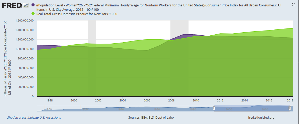
U.S. women's unpaid labor basically equals the state GDP of New York

Yesterday was International Women’s Day, so FRED is taking the opportunity to examine one economic contribution from women that’s often ignored: The value of women’s domestic labor that goes unpaid.

For this calculation, we use Oxfam’s methodology: We calculate the total amount of hours that women spend doing unpaid household work and then use the minimum wage to put a dollar value on that work: 

  1. Take the number of women above age 16 and multiply by 26.7 hours, which is, according to the Bureau of Labor Statistics, the average number of hours per week women spend on unpaid household work.
  2. Multiply this weekly value by 52, the number of weeks in a year.
  3. Multiply the result by the federal minimum wage.
  4. Divide this annual dollar amount by the consumer price index to adjust for inflation. (Note we use annual data here, aggregated at the end of each year, to make the graph easier to read.)

OK. Nice graph. But how big a number is this? To put it in context, let’s compare the value of women’s unpaid labor with all the economic activity recorded in the state of New York.


Customize | Download data

For 2018 (the most recent data available), the dollar value of women’s unpaid work in the U.S. was equal to 86% of all the economic activity recorded in the state of New York. In other years—say, the late 1990s and late 2000s—the value of women’s unpaid work even surpassed New York state GDP. And keep in mind this value is at the low end of the possible range because we use the federal minimum wage and not, for example, higher state minimum wages let alone market wages that correspond to the specific work being done.

How these graphs were created: For the first graph: Search for and select the population of women (series ID LNU00000002). From the “Edit Graph” panel, use “Edit Line”/”Customize data” to search for and add the series for the federal minimum wage (series ID FEDMINNFRWG) and CPI (series ID CPIAUCSL). Adjust frequency to annual. Apply formula ((a*26.7*52*b)/c)*100. From the “Format” tab, choose graph type “Area” and change the color to International Women’s Day purple. For the second graph: Start with the first graph. From the “Edit Graph” panel, adjust the units for CPI to 100 in 2012. Then use the “Add Line” tab to search for and select New York state GDP (series ID NYRGSP). Apply formula a*1000. Finally, adjust the sample period to a time when both series are available.

Suggested by Diego Mendez-Carbajo.

View on FRED, series used in this post: CPIAUCSL, FEDMINNFRWG, LNU00000002


Subscribe to the FRED newsletter


Follow us

Back to Top