Federal Reserve Economic Data: Your trusted data source since 1991

The FRED® Blog

Corporate profits versus labor income

Risk and reward versus slow and steady

This FRED graph shows the evolution of two sources of income in our national economy: the compensation of employees through wages and other salary compensation, and the compensation of capital through profits. Both series are adjusted for inflation and both start at the level of 100 in 1954, which is the first year that’s considered “post-war” for economic purposes. (NOTE: The economic impact of the Korean War has essentially vanished.)

Eyeballing the data leads to two major conclusions. First, corporate profits move a lot, especially in response to general business activity. Profits tend to tank during recessions (noted with gray bars), which is understandable. After all, it’s well understood that investing in a business is a risky undertaking that deserves and often acquires compensation. Employee income is much more stable, but still suffers during recessions. Second, the trends of the two series tend to track each other over several decades, reflecting the general growth of the economy. The past decade and a half seems to be different, though. Never have corporate profits outgrown employee compensation so clearly and for so long. Is it because there’s been a particularly risky climate for investment, or is something else afoot?

How this graph was created: From the release table about national income by type of income, check the two series and click on “Add to Graph.” From the “Edit Graph” panel, add a series by searching for and selecting “GDP deflator,” apply formula a/b, and finally set the index value of 100 to 1954-05. Repeat for the second line.

Suggested by Christian Zimmermann.

View on FRED, series used in this post: CPROFIT, GDPDEF, WASCUR

Is there a skills gap in the South?

Mapping education and unemployment across the U.S.

Much research has been published on the labor market transition from low-skill and routine jobs to high-skill and non-routine jobs at both a national and a local level. But is this job polarization occurring to the same degree across the country? A recent report co-sponsored by the St. Louis Fed looks at the issue of workforce development in light of this changing economy, especially in southern regions of the U.S. that typically rely more on a low-skilled and low-wage labor force. These GeoFRED maps show that the southern states typically have lower levels of educational attainment for both high school (map above) and bachelor’s degrees (map below).

With a currently tight labor market, there’s demand for skilled workers, since these positions are also seeing the most growth. But for some regional economies, especially in southern states, there seems to also be an unmet demand for middle-skill jobs that require more than a high school education but not a four-year college degree.

The FRED graph below shows that the unemployment rate is lower for those with some college and/or an associate’s degree than (i) for those with only a high school diploma and (ii) the overall national unemployment rate.

The southern states trail the rest of the nation in median wages and there are more persistently poor counties in the south. There seems to be an opportunity, then, for investing in that workforce to create a better-skilled labor pool to help grow the regional economy.

How these maps were created: The original post referenced interactive maps from our now discontinued GeoFRED site. The revised post provides replacement maps from FRED’s new mapping tool. To create FRED maps, go to the data series page in question and look for the green “VIEW MAP” button at the top right of the graph. See this post for instructions to edit a FRED map. Only series with a green map button can be mapped. For the FRED graph, search for “civilian unemployment rate.” In the “Edit Graph” panel, add two lines by searching for “unemployment rate associate degree” (series ID LNS14027689) and “unemployment rate high school” (series ID LNS14027660).

Suggested by Shuowei Qin and Christian Zimmermann.

View on FRED, series used in this post: LNS14027660, LNS14027689, UNRATE

Alternative money for transactions

What if gold or Bitcoin replaced the dollar?

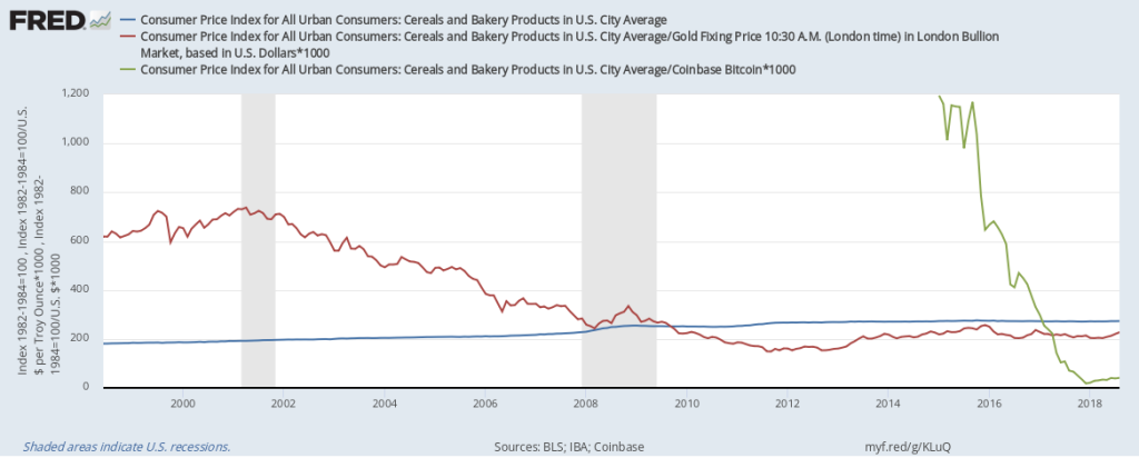
What if U.S. retail prices were not denominated in U.S. dollars, but instead were denominated in gold or Bitcoin? Paying for a loaf of bread with gold wouldn’t be very practical, as you’d need a very small speck of the precious metal. But one can imagine a system of gold substitutes, such as notes giving you ownership of a fraction of an ounce of gold, thereby overcoming the small-change problem. With Bitcoin, it’d be much easier, as a virtual currency can be divided any way you want. Now, let’s look at actual prices. FRED doesn’t have price data on just a loaf of bread, but it does have the consumer price index for cereals and bakery products, so let’s use that. The blue line shows the evolution of the U.S. dollar price of a basket of baked goods. The red line shows the price in gold, and the green line shows the price in Bitcoin. It’s apparent that the dollar price is much more stable and has slowly increased over time. The gold price has considerable fluctuations from month to month. While the gold price seems to have a tendency to decrease, this isn’t always true, which you can see if you enlarge the sample window. As for Bitcoin, the fluctuations are extreme, even when you restrict the sample period to the past year. What’s behind the differences? The Fed’s mandate is to stabilize prices as expressed in U.S. dollars, and this is quite apparent in this graph. The Fed does this by adapting to changes in the demand for dollars. That isn’t possible with gold, as its supply is determined by worldwide mining success, which is outside of the control of any institution. The same applies to Bitcoin, with the additional constraint that mining success keeps dwindling. How this graph was created: NOTE: Data series used in this graph have been removed from the FRED database, so the instructions for creating the graph are no longer valid. The graph was also changed to a static image. Suggested by Christian Zimmermann.
View on FRED, series used in this post: CBBTCUSD, CUSR0000SAF111, GOLDAMGBD228NLBM


Subscribe to the FRED newsletter


Follow us

Back to Top