The FRED® Blog

Uncategorized

S’weird in Switzerland

Today is Switzerland’s national holiday, and of course FRED has Swiss data, which can be especially interesting because the Swiss economy is in many ways out of the ordinary. Previous FRED Blog posts have discussed the “peculiar” Swiss unemployment rate as well as its negative interest rates. In fact, as of today, the Swiss 50-year government bond has a negative nominal yield.

Today we look at the Swiss exchange rate. The graph shows in green the exchange rate of the Swiss franc with the euro, including a dramatic change on January 15, 2015. Unlike other countries’ exchange rate troubles, this event is actually an appreciation of the Swiss franc. Swiss franc appreciation is bad for exports, which Switzerland depends on. Because the franc has long been viewed as a refuge currency when economic trouble brews in Europe or elsewhere, it has been under a lot of appreciation pressure for some time. The Swiss National Bank has tried to cap the exchange rate at 1.20 for some time, flooding the currency markets with francs in exchange for euros and other assets. This sounds like a dream come true for any central banker: print money at will without negative consequences. Yet, this environment was unsustainable and, on January 15, 2015, the SNB decided to stop managing the exchange rate. The franc appreciated by about 20% almost immediately, and LIBOR interest rates dropped deep into negative territory. The graph shows the 3-month LIBOR in red.

How this graph was created:  NOTE: Data series used in this graph have been removed from the FRED database, so the instructions for creating the graph are no longer valid. The graph was also changed to a static image.

Suggested by Christian Zimmermann.

View on FRED, series used in this post: CHF3MTD156N, DEXSZUS, DEXUSEU

The equity premium

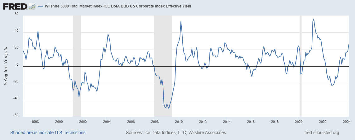
The equity premium is the difference between the return on a stock and the return on a bond. Typically, it’s positive—meaning stock returns are higher—although it can be negative when the stock market goes through some rough times. Over the long run, it’s definitively positive because bonds are senior to stocks in any liquidation: Bonds carry less risk and, therefore, less yield. Measuring the equity premium is tricky, though. To do it right, you must compare stocks and bonds from firms of similar quality and aggregate over many firms to smooth out anecdotal evidence and small-sample errors. Using broad indexes may also be distorting, as the firm composition may not be comparable between stock and bond indexes.

In the graph above, FRED shows one of the many examples of how you can measure the equity premium with available data, using here the very broad Wilshire 5000 index for stocks and the BofA Merrill Lynch BBB index for bonds. (BBB is a category that may be somewhat representative: not very safe but not very risky, either.) You can experiment on FRED with many other combinations. Again, you’ll find the result is positive most of the time, reflecting the simple investment advice that if saving for the long-run warrants a diversified portfolio of stocks.

How this graph was created: Search for “Wilshire 5000” and choose the total market index. Change units to “Percent Change from Year Ago.” In the “Edit Line” tab, add the second series by search for “BBB effective yield.” Customize the data by applying the formula a-b. Finally, change the frequency to monthly to make the graph less noisy.

Suggested by Christian Zimmermann.

View on FRED, series used in this post: BAMLC0A4CBBBEY, WILL5000IND

To what degree do we have degrees?

Bachelor’s degrees grow more common every year. The Census Bureau estimates, as of 2015, that 32.5% of the U.S. population 25 years or older have at least a bachelor’s degree. Yet, the GeoFRED map shows that the percentages of the vast majority of counties are lower than the national average: Almost 90% of counties are at 29.5% or less.

Looking at the regions with the highest and lowest percentages can give us some important insights. The southern U.S. claims 9 of the bottom 20 counties, which goes up to 16 of 20 if we include Kentucky and Texas. Loving County, Texas, has the lowest percentage: With a population of 112, it has only 3.7% with at least a bachelor’s degree. The top 20 counties are spread throughout the country, 7 of which are from the state of Virginia: Falls Church City and Arlington County, respectively, have 72.8% and 71.2% with at least a bachelor’s degree. This above-average cluster around Washington D.C. is home to many Fortune 500 companies and multiple federal government agencies, including the Department of Defense’s main base of operation, the Pentagon.

How the graph was created: The original post referenced an interactive map from our now discontinued GeoFRED site. The revised post provides a replacement map from FRED’s new mapping tool. To create FRED maps, go to the data series page in question and look for the green “VIEW MAP” button at the top right of the graph. See this post for instructions to edit a FRED map. Only series with a green map button can be mapped.

Suggested by Joshua Berry


Back to Top